What we love about this beauty brand lookbook example
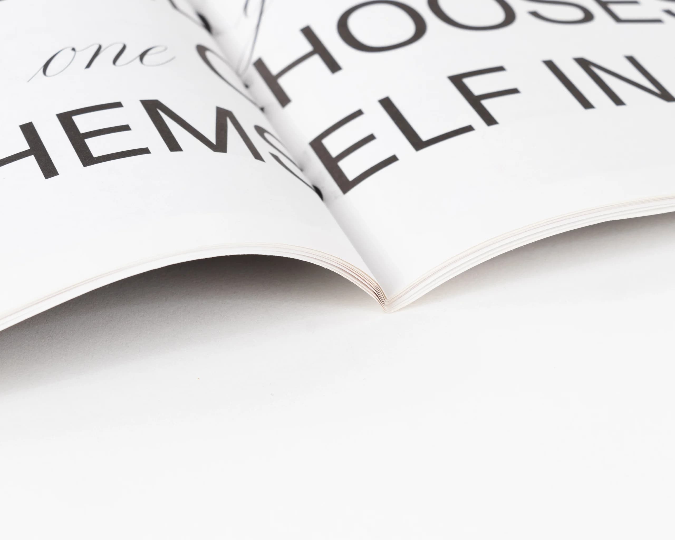
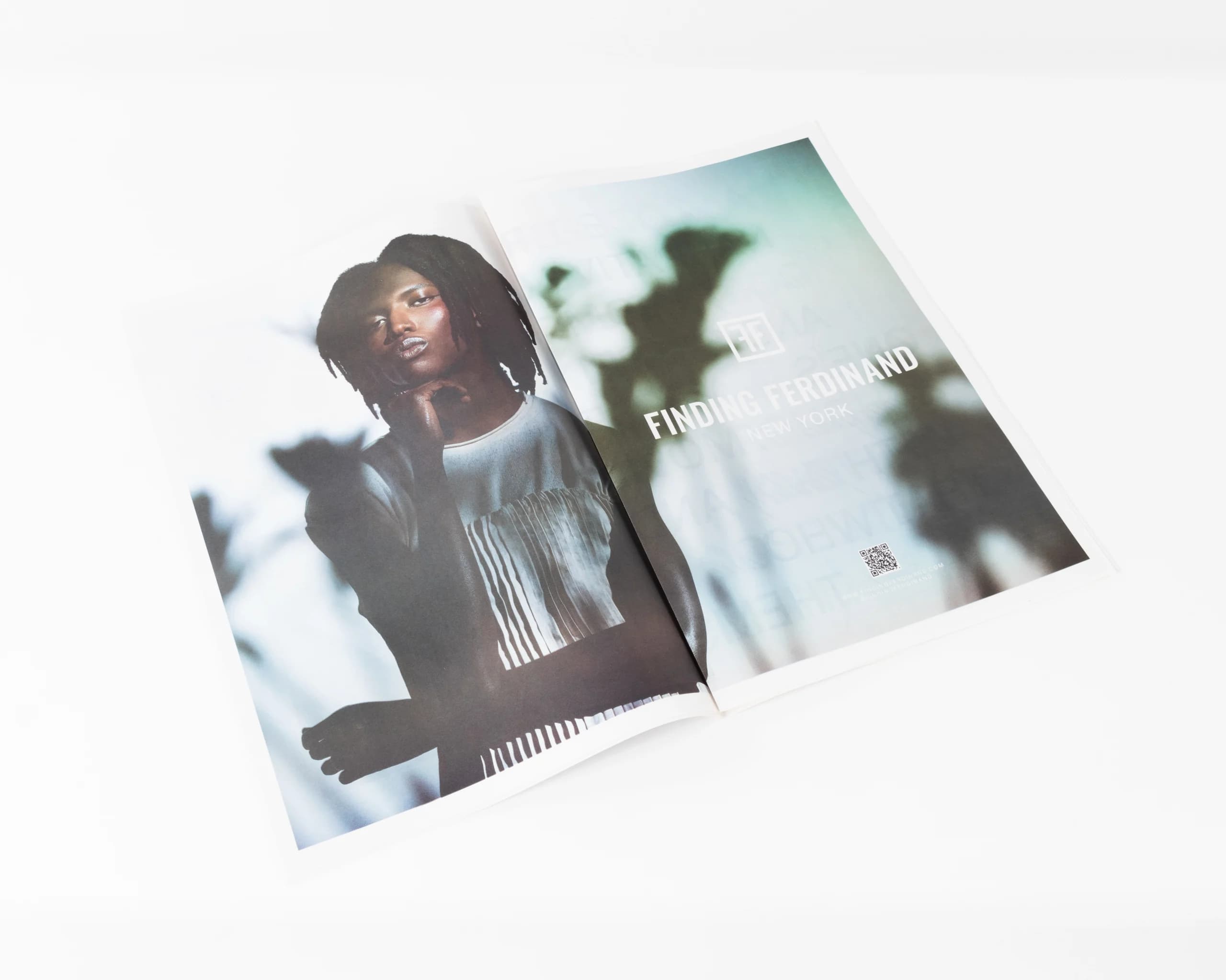
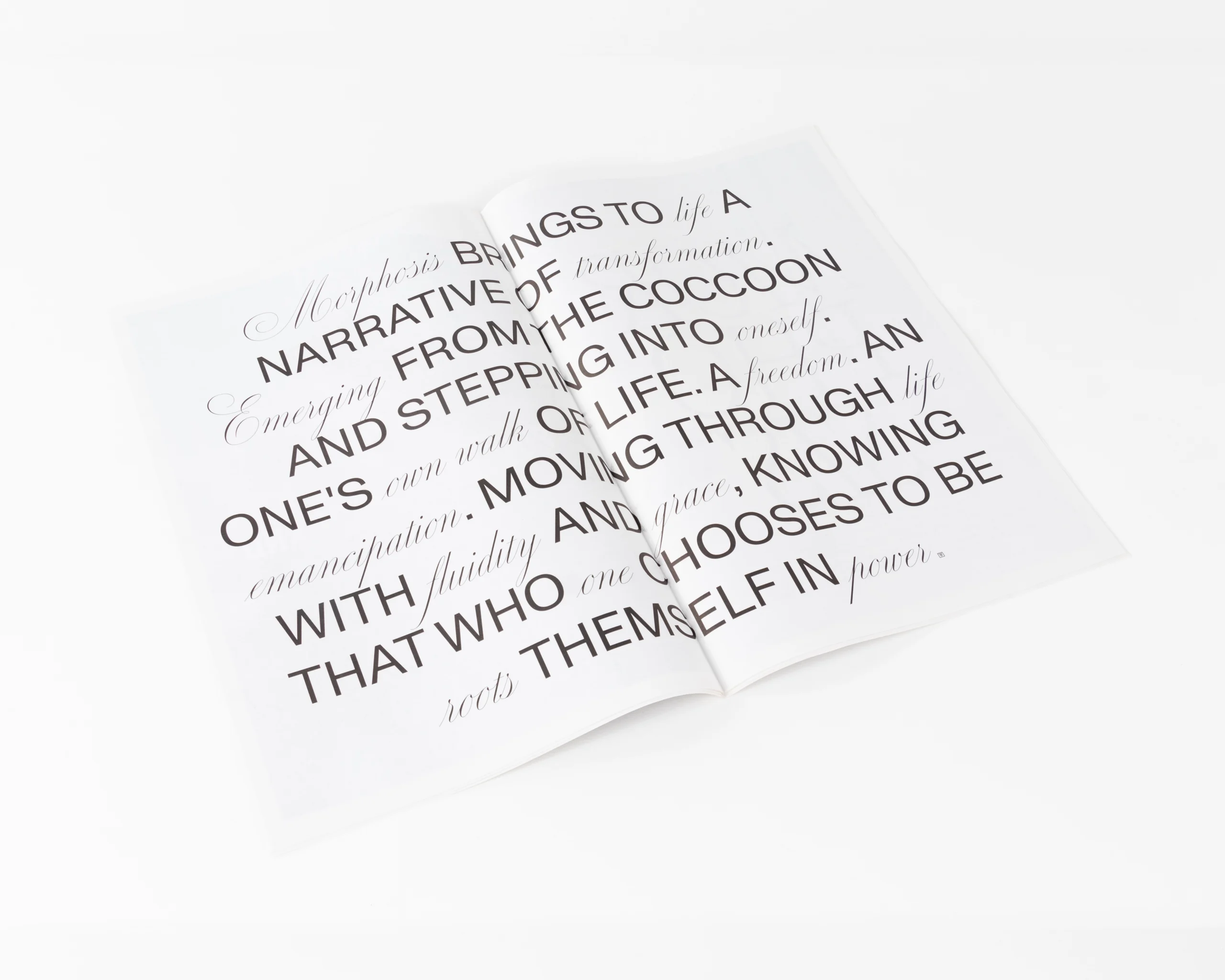
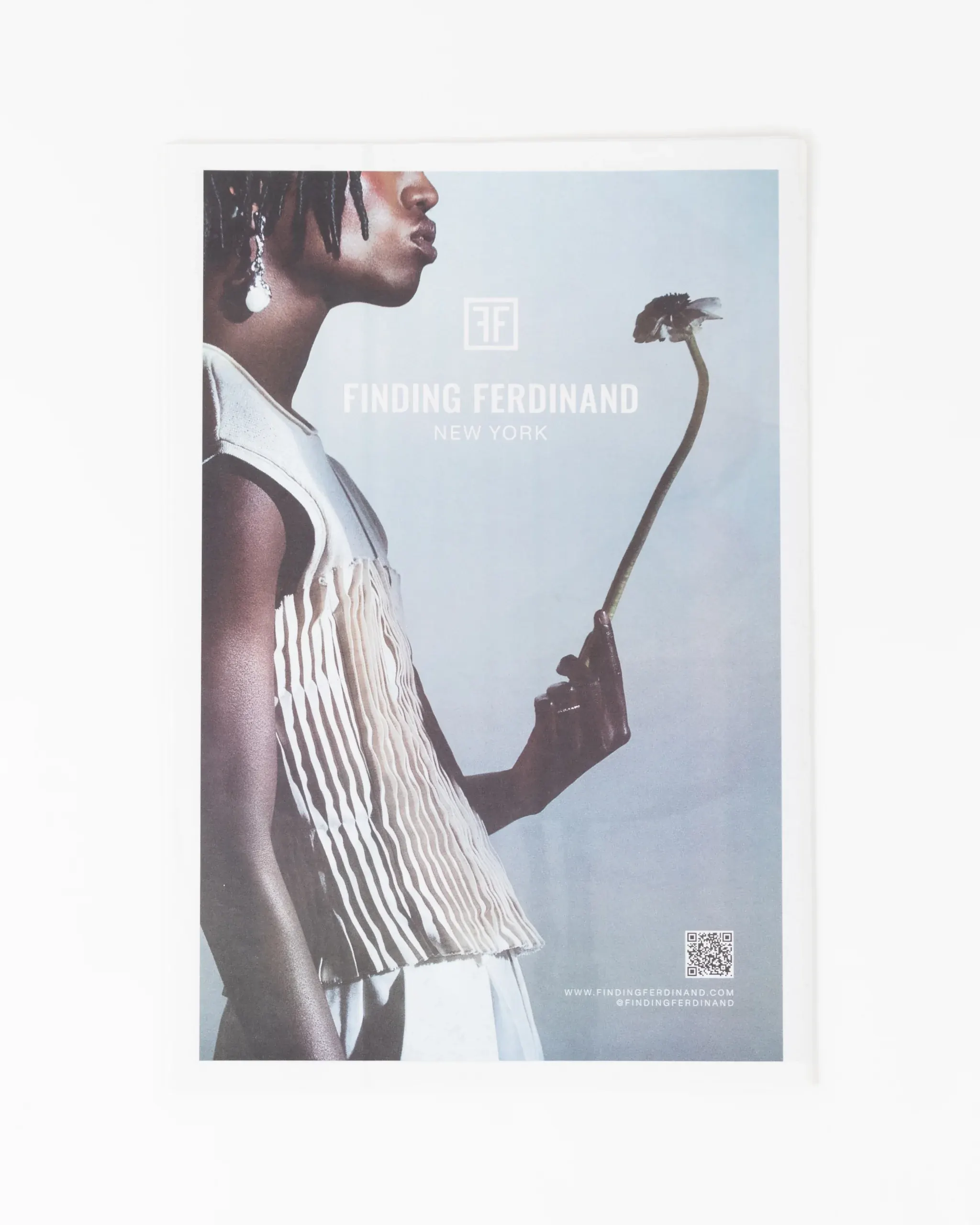
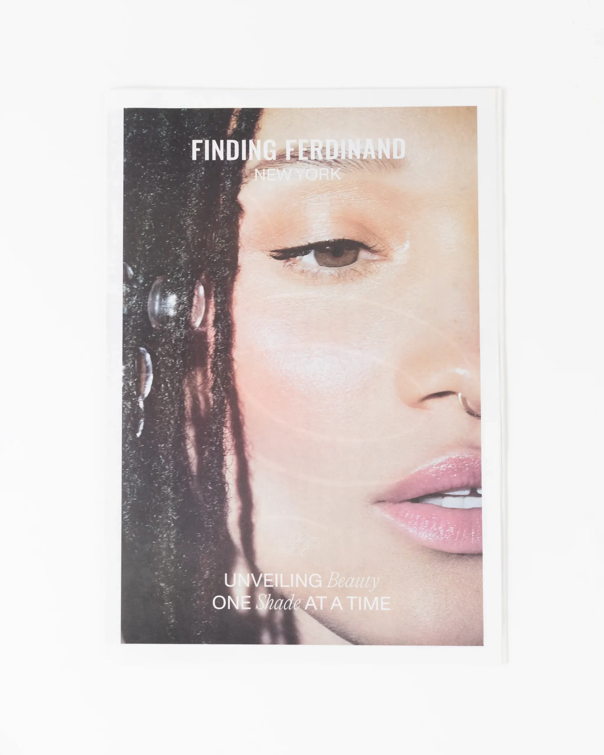
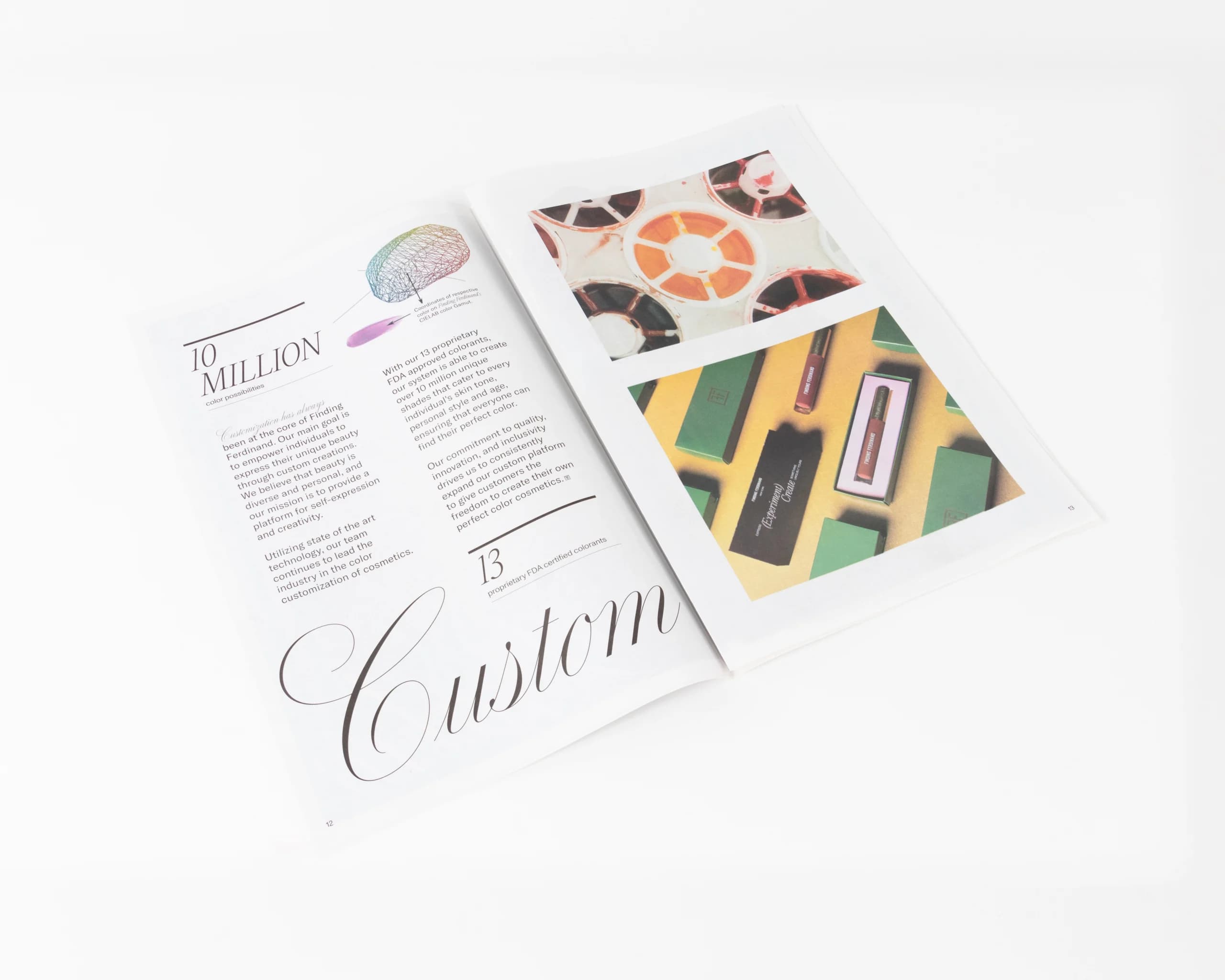
The Finding Ferdinand lookbook captures the brand’s artistry and individuality through a clean, editorial design that feels both aspirational and approachable. Printed on uncoated stock, it offers a soft, tactile finish that complements the natural tones of the photography while keeping type crisp and readable.
Full-page portraits and bold typographic spreads create strong visual moments, while the saddle-stitch binding allows the booklet to lay flat for immersive viewing. The layout moves fluidly between brand storytelling, product showcases, and conceptual imagery, making it ideal for high-end beauty marketing.
At Thomas Group Printing, we help brands craft lookbooks that elevate their identity, selecting paper, finishes, and layouts that reflect their vision while producing a premium piece that stands out in competitive markets.
Production notes for beauty brand lookbooks
Beauty lookbooks need soft tactility, accurate color, and enough visual rhythm to support product storytelling. The Finding Ferdinand piece uses uncoated stock, portrait-driven spreads, and a booklet structure that lets product imagery, brand language, and conceptual visuals move together.
For similar cosmetics, skincare, and personal-care lookbooks, we review color matching, skin tone reproduction, image sequence, paper finish, binding style, and whether copies are used for press outreach, retail meetings, or campaign mailers. Those checks protect both the product color and the brand mood.