What we love about this folded film series brochure
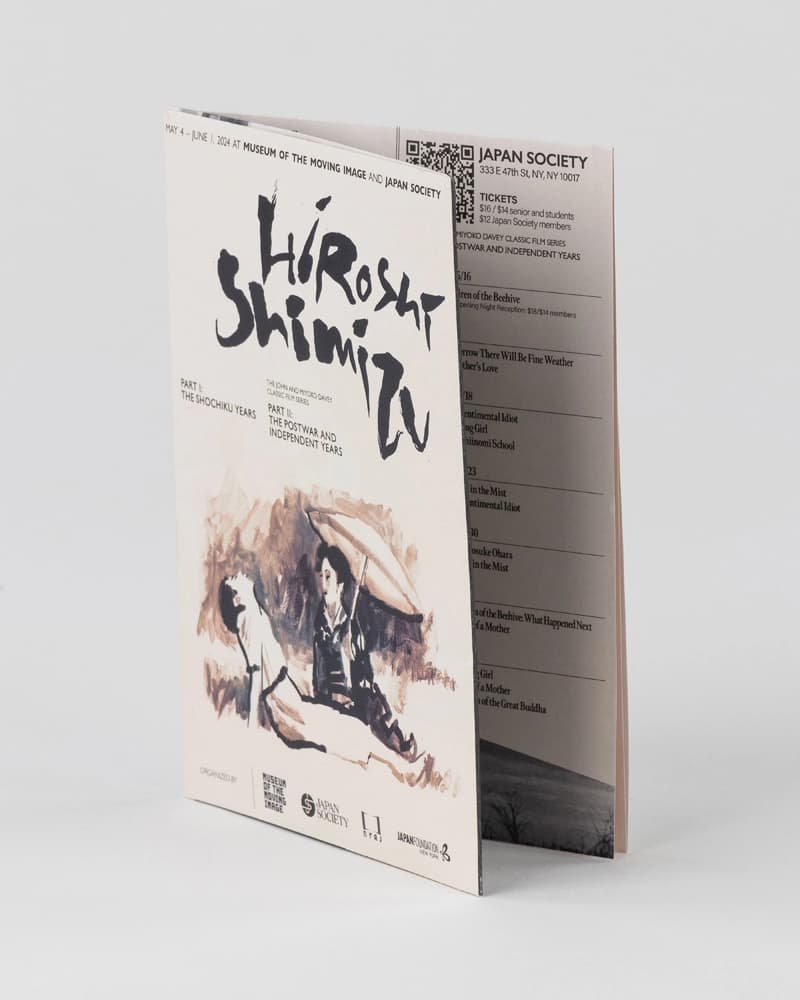
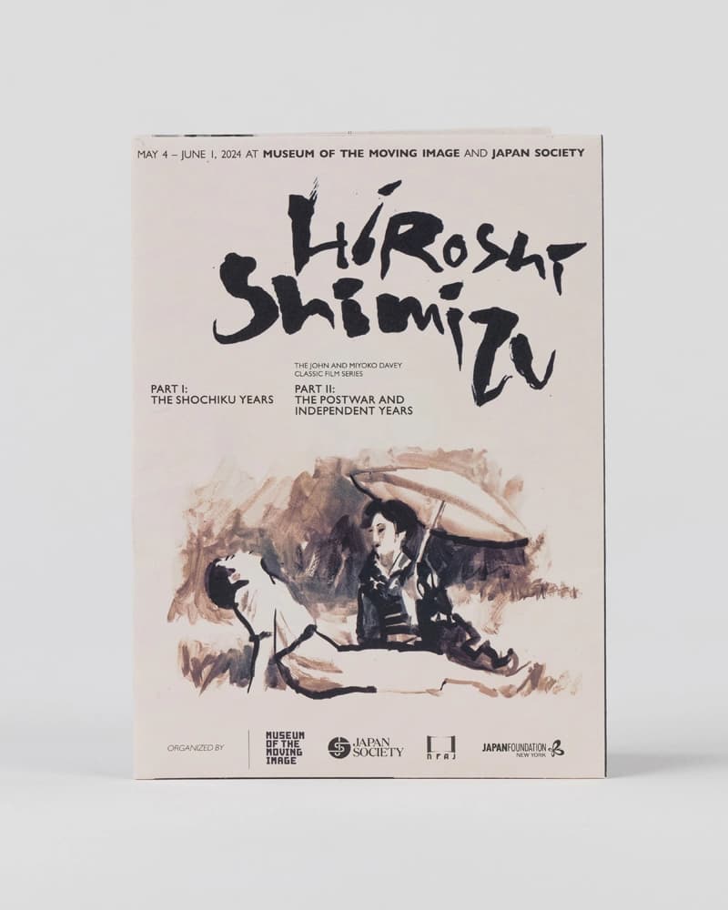
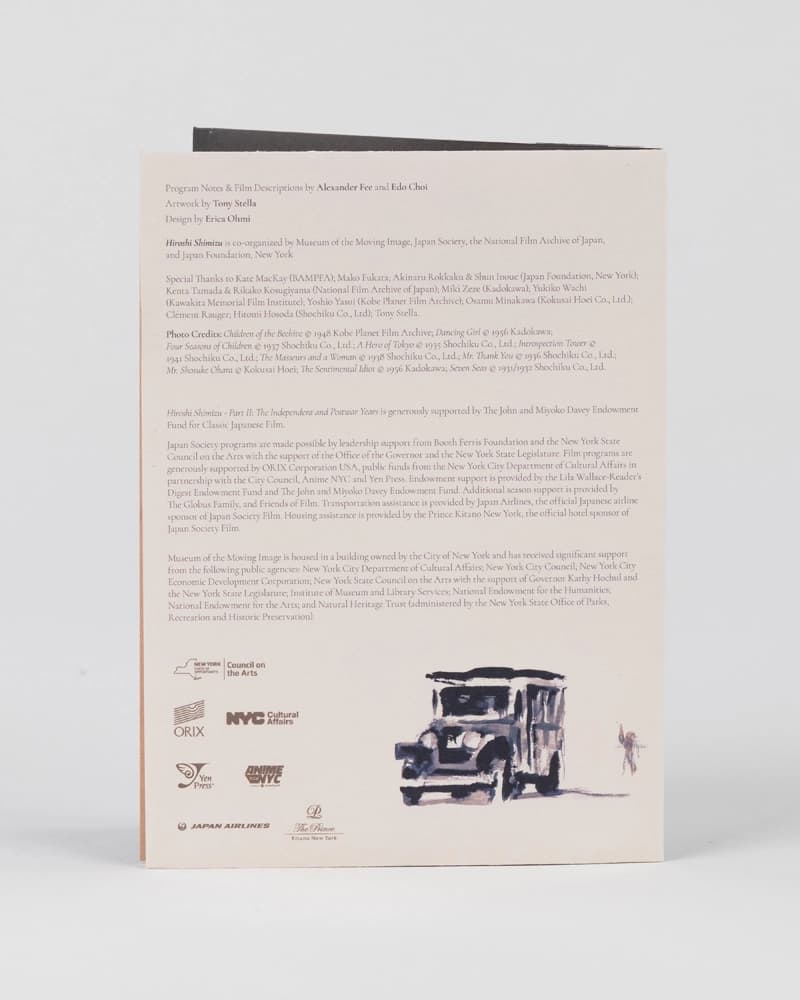
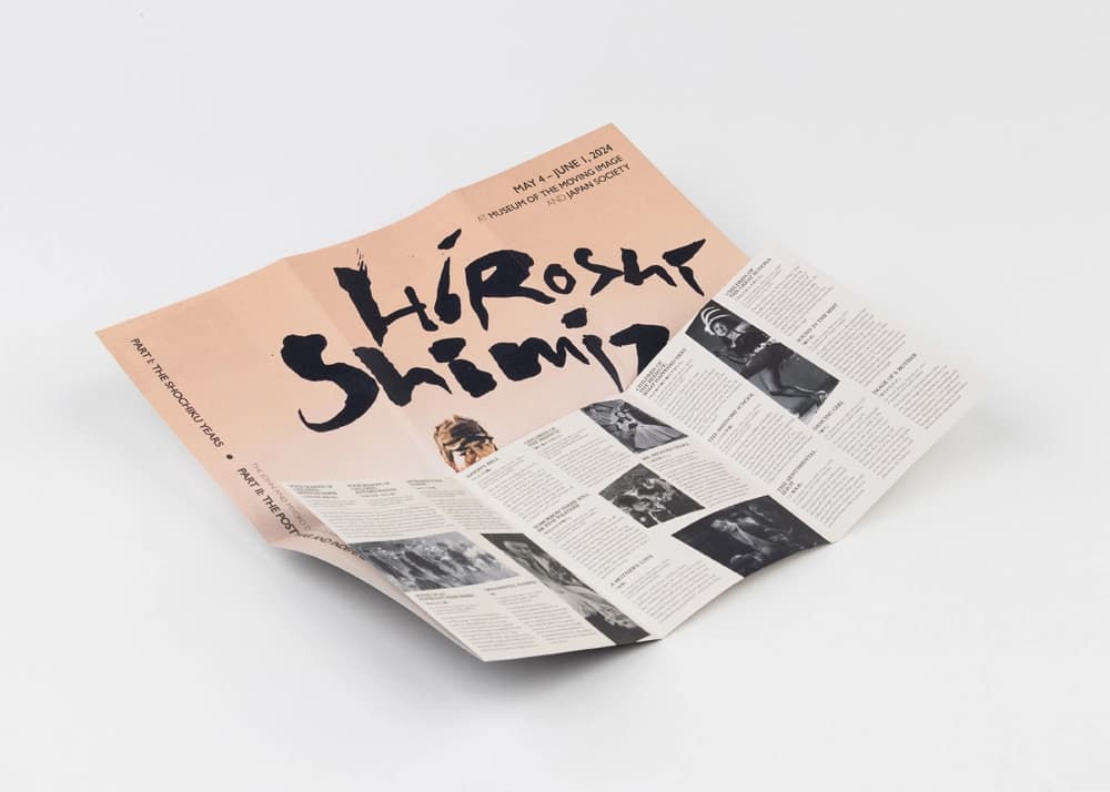
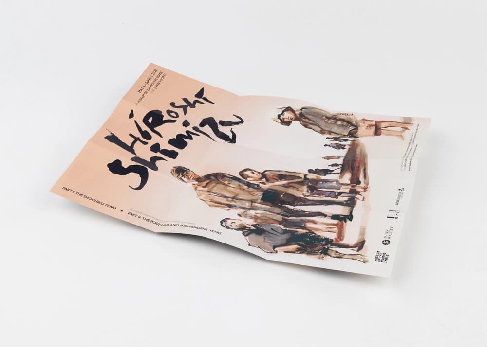
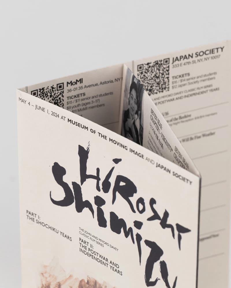
This brochure for the Hiroshi Shimizu film retrospective is a standout example of thoughtful event marketing in print. It combines program detail and visual storytelling in a compact, tactile format that’s both informative and easy to carry.
Digitally printed on uncoated paper, the design uses muted tones and expressive brush-style typography to mirror the character of the film series. High-resolution black-and-white images reproduce cleanly, while careful folding and scoring maintain structure and readability.
Production notes for film series brochures
Film series brochures need to present schedules, stills, credits, and curatorial context without feeling crowded. This Hiroshi Shimizu piece uses an uncoated finish and restrained typography so the brochure feels connected to the retrospective rather than like a generic handout.
For similar cinema, festival, and cultural programming projects, we review fold sequence, panel hierarchy, image reproduction, paper opacity, and distribution timing. Those decisions affect whether readers can quickly find screening information while still keeping the finished piece collectible.