What we love about this newspaper-style art fair guide
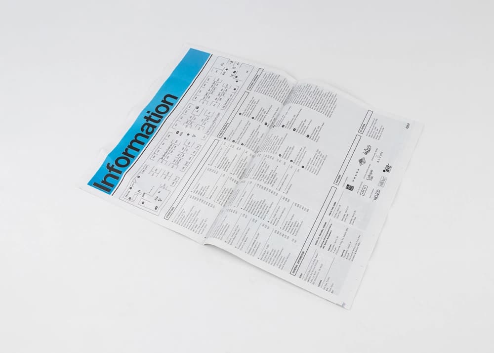
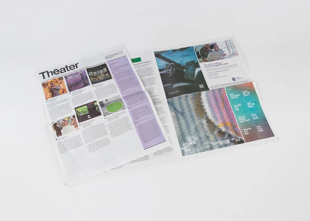
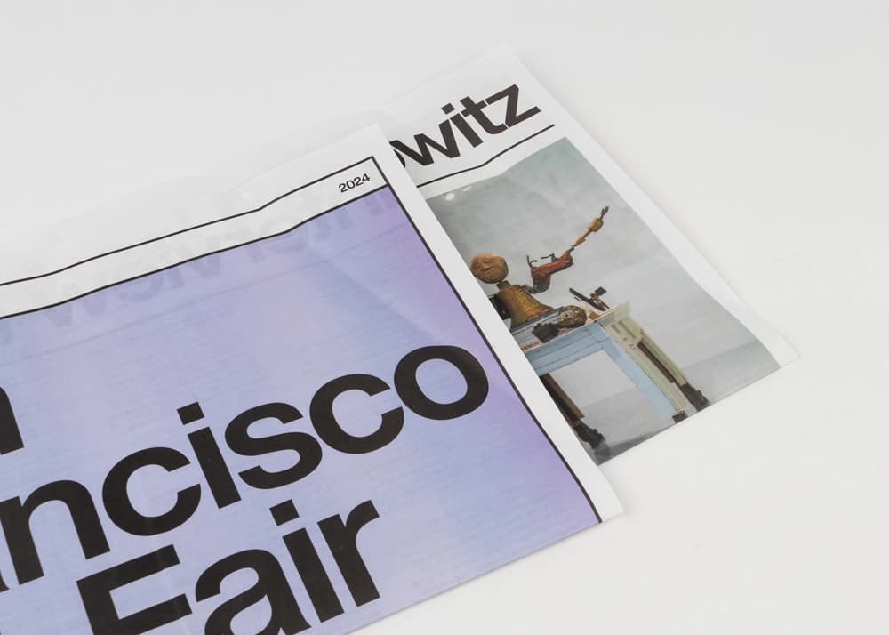
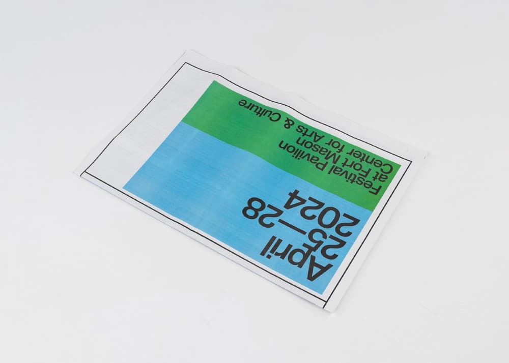
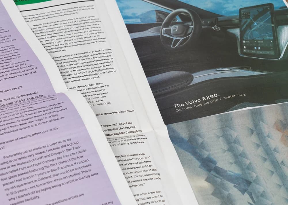
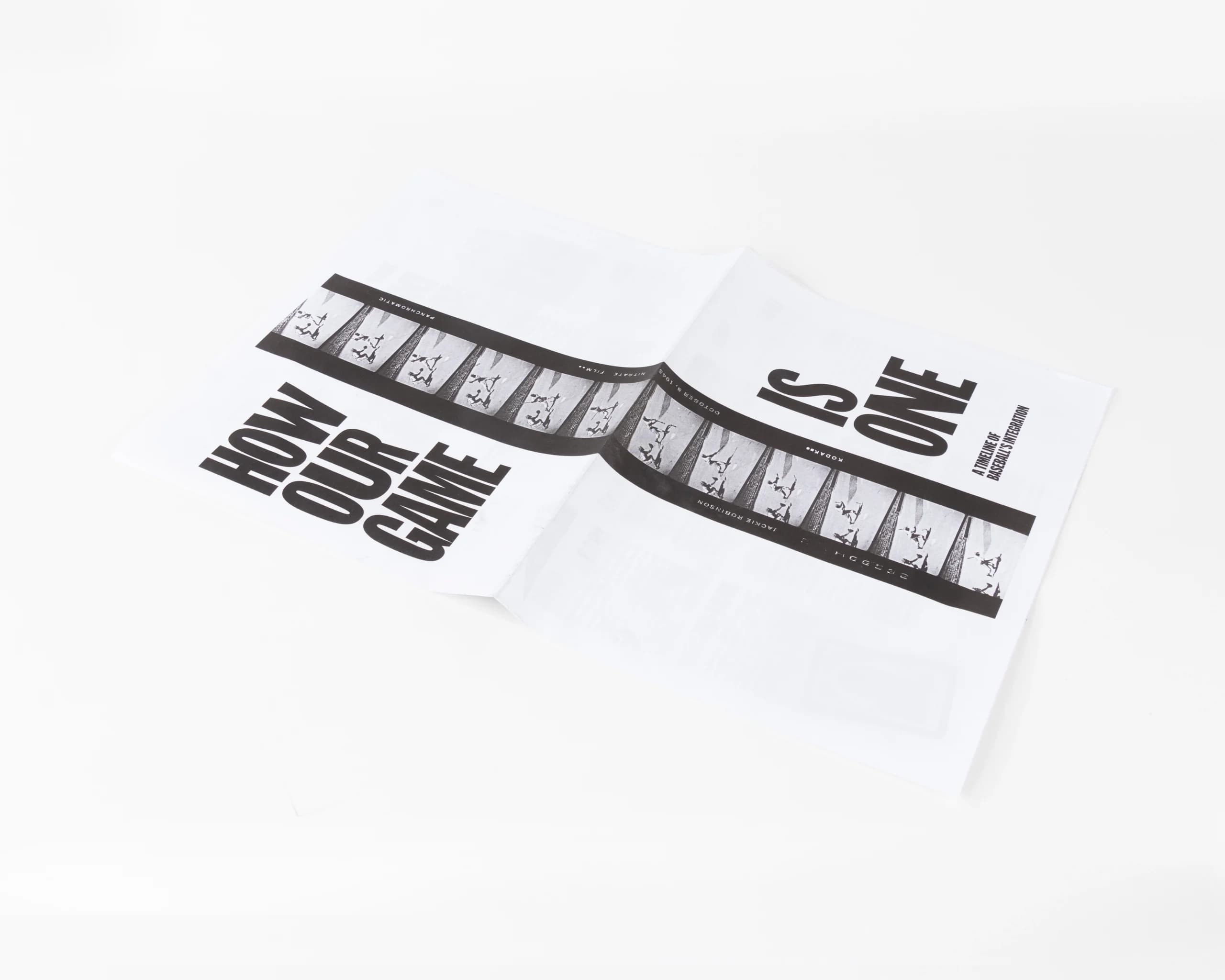
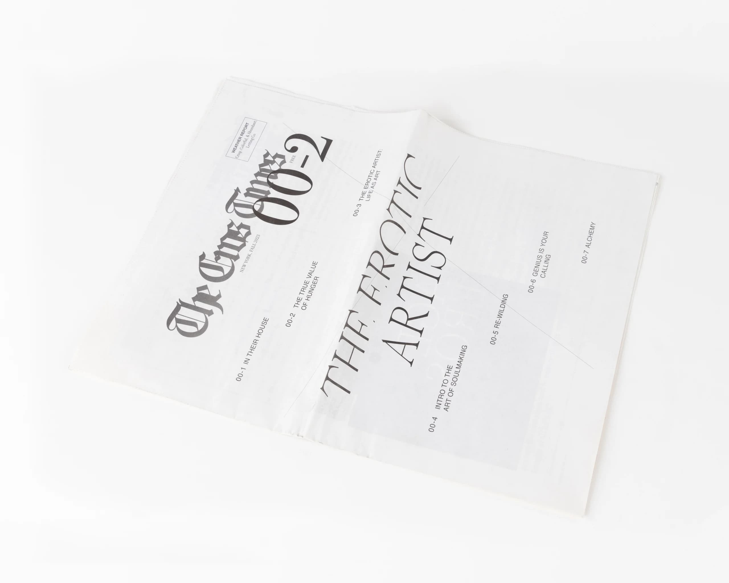
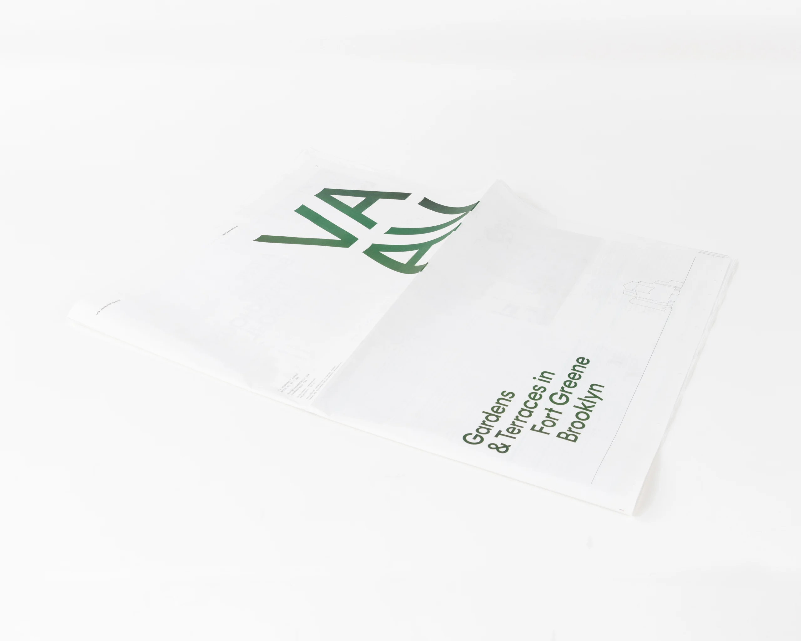
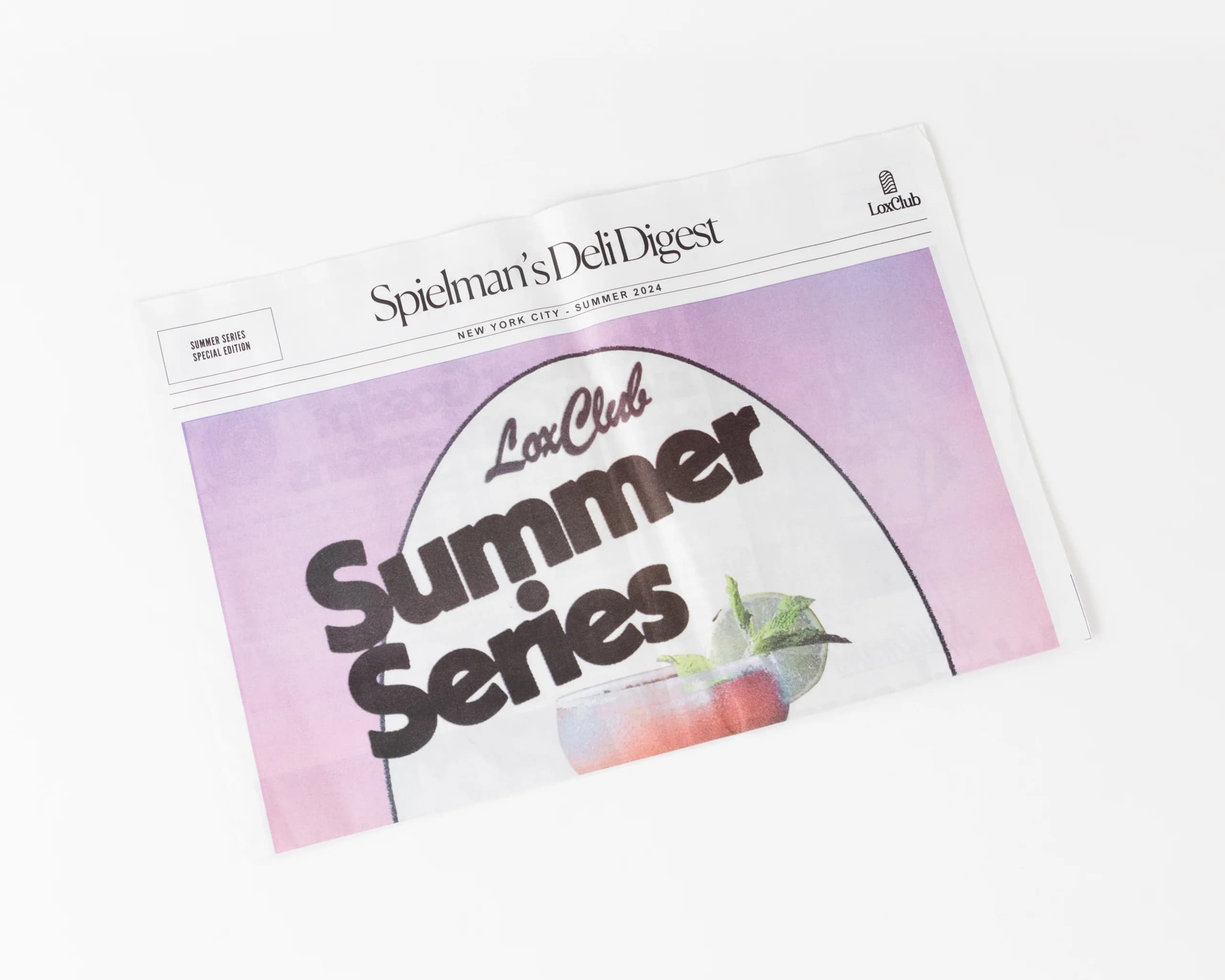
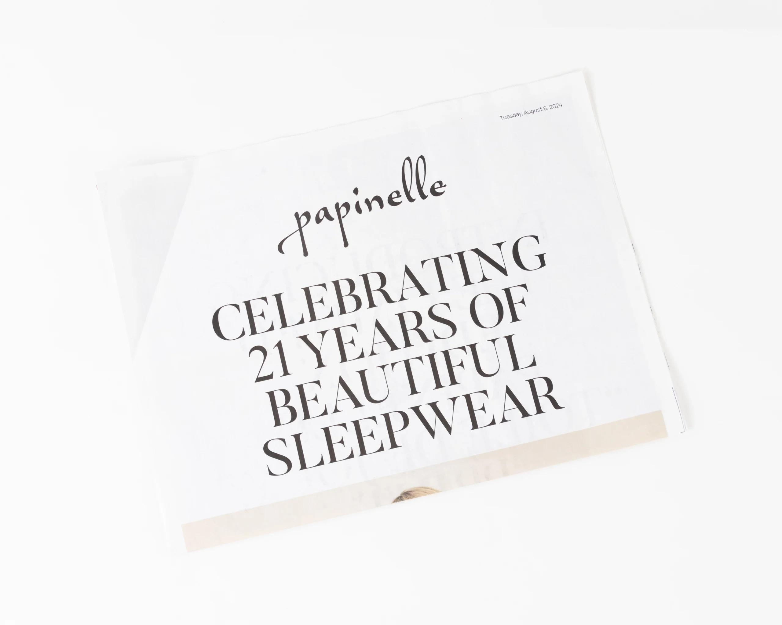
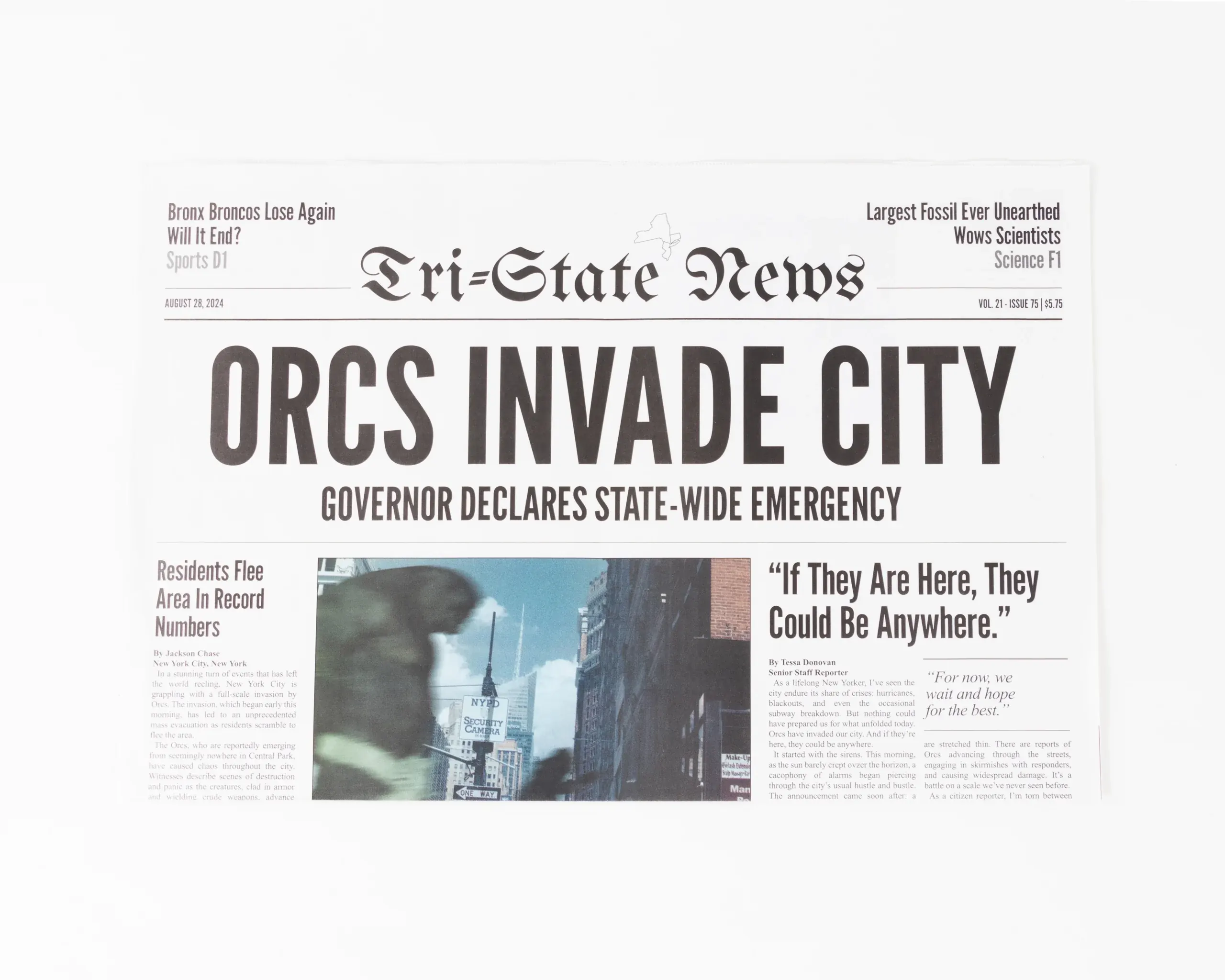
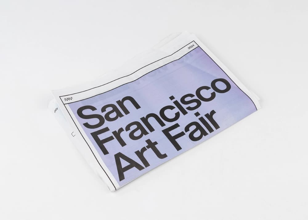
This printed guide for the San Francisco Art Fair blends utility with sharp design, serving as both an informational tool and a collectible memento. Printed on lightweight newsprint, it’s ideal for high-volume distribution without sacrificing aesthetic appeal.
The uncoated paper stock lends a soft, tactile finish that enhances readability and color absorption. Spot-on color accuracy brings artwork reproductions and sponsor ads to life, while clean black ink delivers crisp text across layouts. Full-bleed sections and varied column widths add visual rhythm and clarity.
Production notes for art fair newsprint guides
Art fair guides have to serve several jobs at once: event map, schedule, sponsor inventory, and collectible printed object. This San Francisco Art Fair piece uses lightweight newsprint so visitors can carry it easily while still giving artwork reproductions, ads, and wayfinding information enough room to breathe.
For similar fair, gallery, and festival guides, we check page count, section order, ink density, ad placement, fold pattern, and delivery timing before press. That planning keeps high-volume handouts practical while protecting legibility and color consistency across artwork-heavy pages.