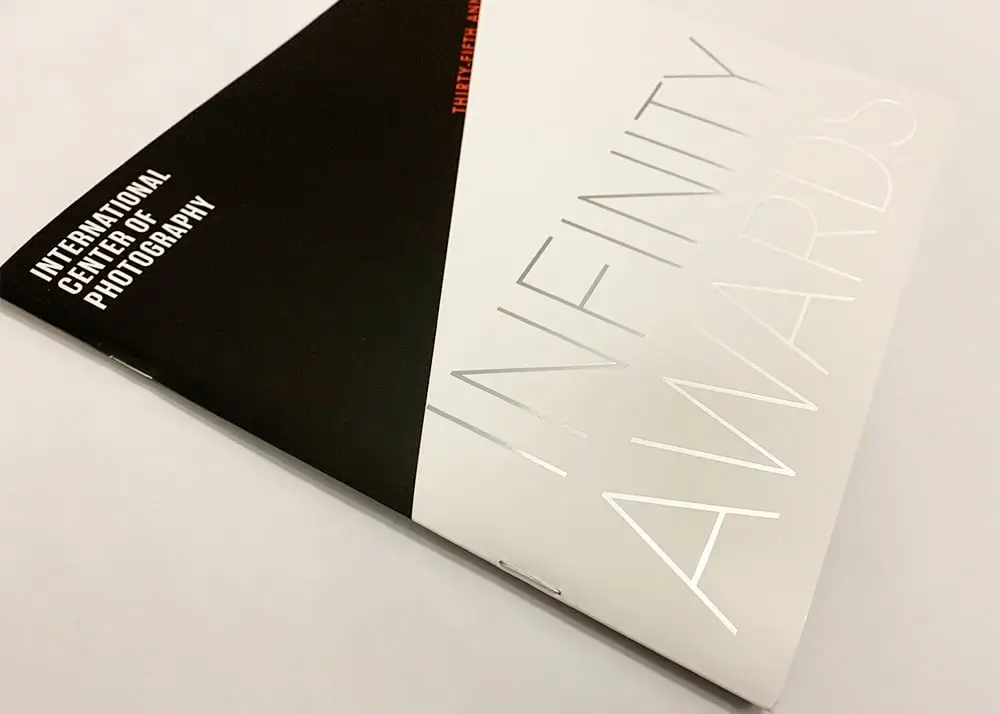
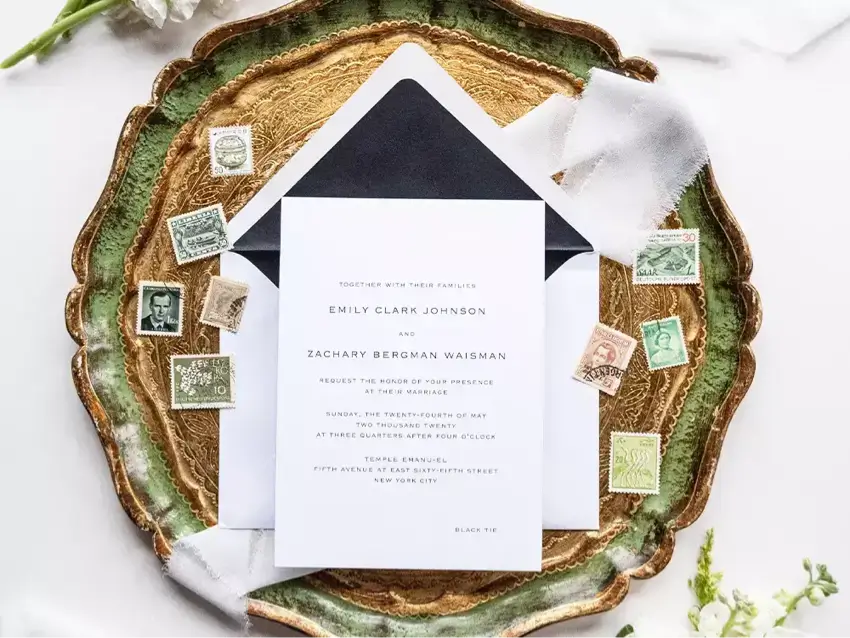
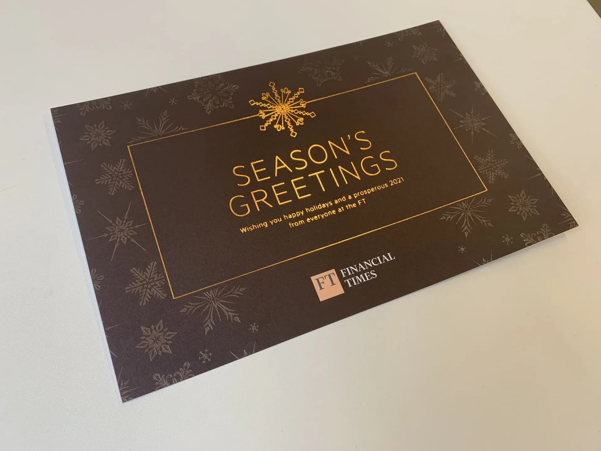
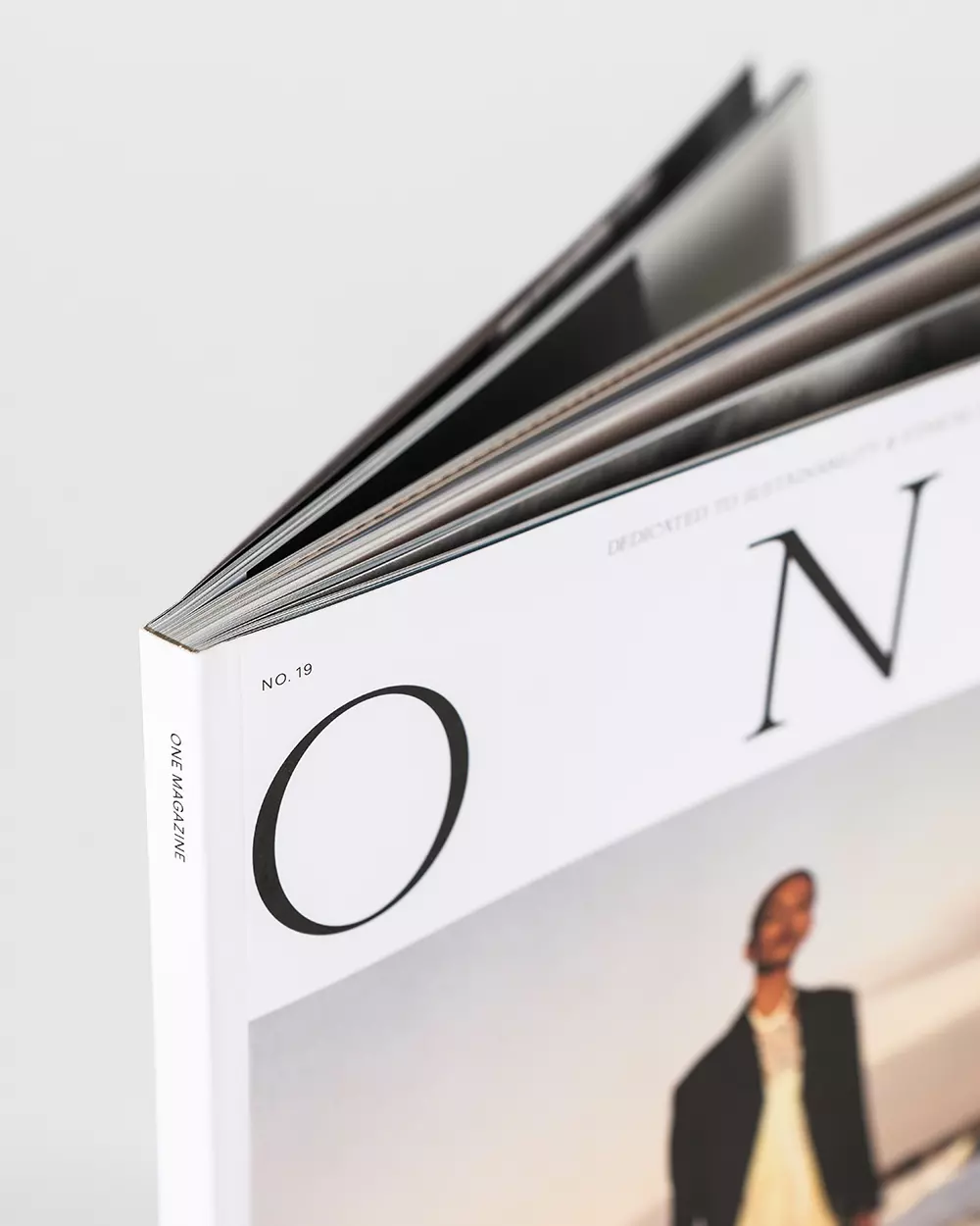
Foil can turn a small part of a design into the detail people remember. A title catches the light. A logo stands apart from the photography around it. An invitation changes as it moves in your hand.
The strongest results begin with a clear purpose for the finish. These six projects from Thomas Group Printing’s Inspiration collection show different ways to use foil across books, packaging, invitations, and presentation materials.
Your next foil printing project starts here.
Every example below was printed for a Thomas Group Printing client. We offer foil stamping as an add-on for many of our printing services. Our team can help you choose an approach for your design, paper, and format.
Ready to discuss your design? Get a quote and guidance for your foil printing project.
1. Victoria Beckham Beauty: a restrained gold accent
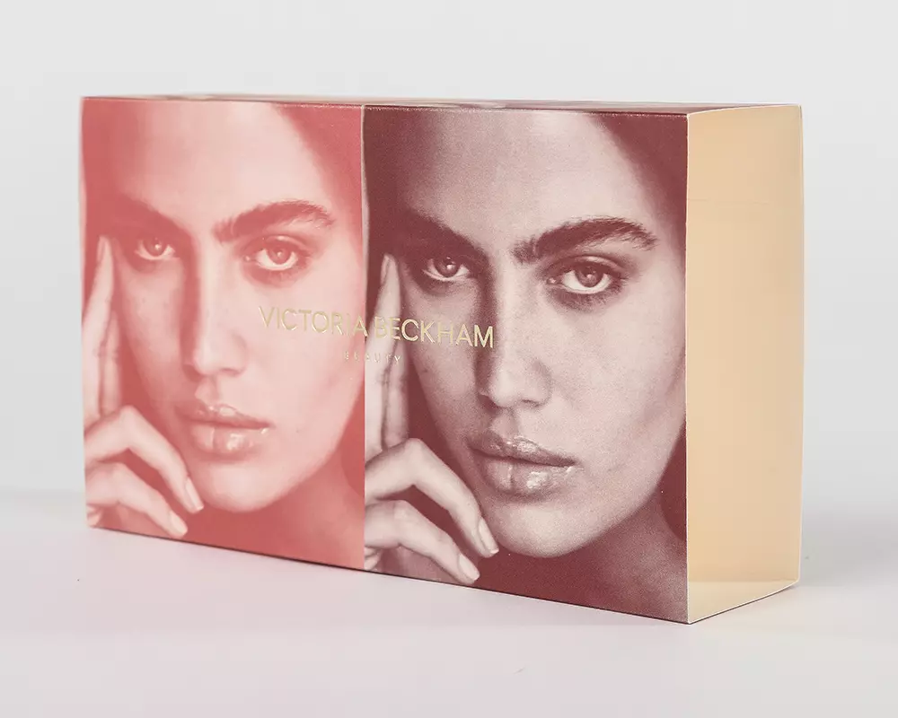
The photography does most of the storytelling on this Victoria Beckham Beauty box sleeve. The gold brand mark gives the layout a second point of interest without competing with the faces behind it.
It is a useful example for packaging designers working with strong imagery: a foil detail can stay compact and still create a clear focal point. Its placement matters as much as its size, particularly when the printed piece folds around a box.
See the Victoria Beckham Beauty project.
2. Success Academy: holographic foil with a sense of movement
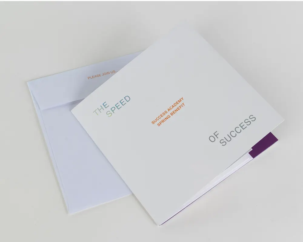
Holographic foil brings a changing finish to this Success Academy Spring Benefit invitation. The white background gives the lettering room to work, while the folded format makes opening the invitation part of the experience.
For a benefit, launch, or celebration, that interaction can help establish the tone before the recipient reads the event details. The design also shows the value of restraint: open space makes the finish easier to notice.
Explore the Success Academy invitation.
3. Barnard: silver foil lettering on a gatefold
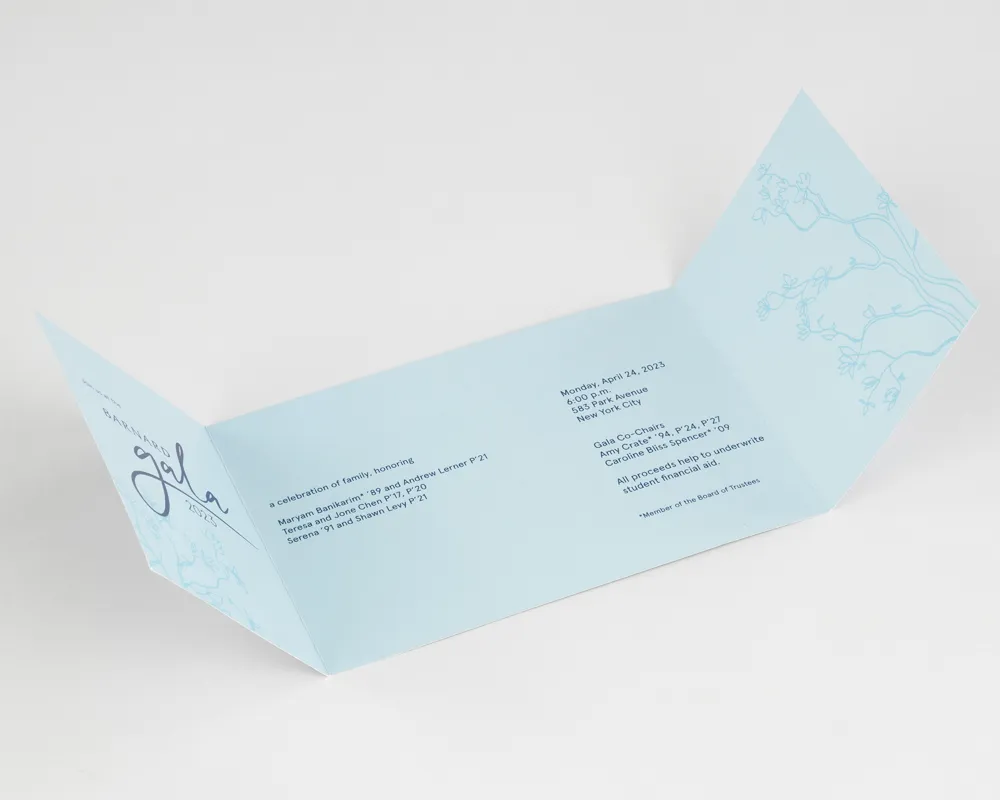
Silver foil lettering gives the Barnard Gala invitation its touch of glamour. It sits on a heavyweight silk cover, and the gatefold sets up how the details are revealed as the piece opens.
Together, the lettering, stock, and fold give the invitation a formal character. It is a strong reference for designers considering foil for an event name or other display lettering on a folded piece.
View the Barnard Gala invitation.
4. Codex Sassoon: a coordinated presentation package
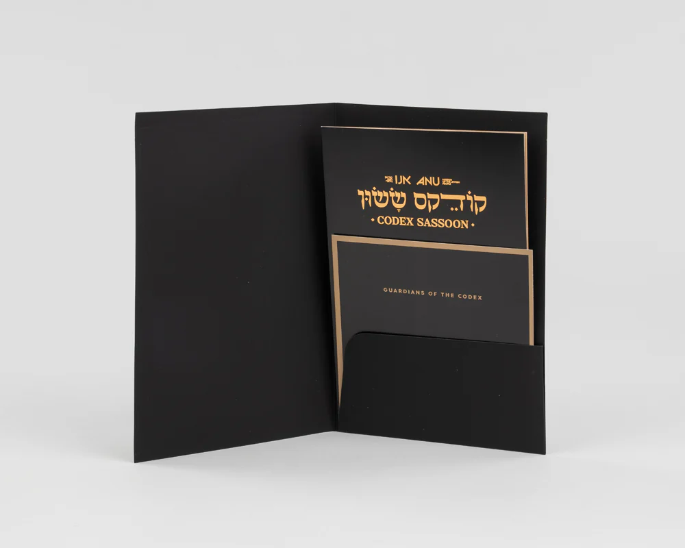
The Codex Sassoon project for the Museum of the Jewish People uses gold detailing within a coordinated black presentation package. The folder and inserts feel related because the color and graphic treatment carry across the pieces.
That consistency is particularly useful when a project contains several components. The finish helps the collection read as one considered presentation rather than a set of unrelated handouts.
See the Codex Sassoon package.
5. Pairs: a title that holds its own beside photography
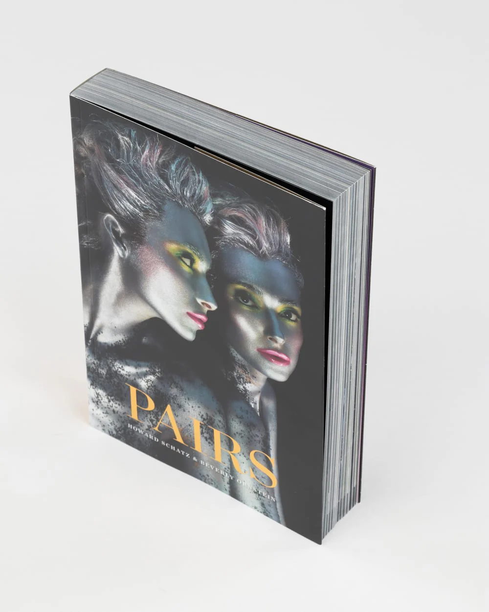
The cover of Pairs, by Howard Schatz and Beverly Ornstein, combines vivid photography with a gold title. The lettering remains distinct while leaving the image as the main event.
For photography books, portfolios, and other image-led publications, this is a helpful balance. The finish adds another visual layer while keeping the cover focused on the work inside.
6. Surf Row Residences: quiet detail on an open cover
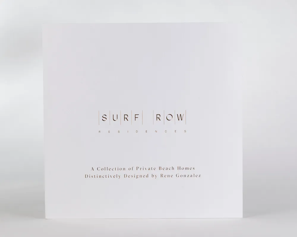
The Surf Row Residences book takes a quieter approach. A spacious white cover gives the foil branding a clean setting, with typography and open space carrying the rest of the design.
This is a useful reference for property books, proposals, and presentation publications that need to feel considered without a heavily decorated cover. A limited finish can support that effect when the layout gives it room.
View the Surf Row Residences book.
Planning foil for your own project
Before committing to a finish, share the artwork and intended format with your printer. Useful details include the piece’s finished size, quantity, paper or packaging material, foil color, and where the foil should appear.
Fine lettering, broad solid areas, folds, and edges can each affect the production approach. A physical reference is also useful when the appearance of the finish is central to the design.
If you are combining several pieces, consider them together. The folder, invitation, insert, or book cover should work as a set, both visually and when assembled.
Find the right finish for your idea
Have a book, invitation, or packaging project in mind? Send TGP your artwork, specifications, and deadline. The team can help you discuss foil options and coordinate the details around the finished piece.