What we love about this catalog example
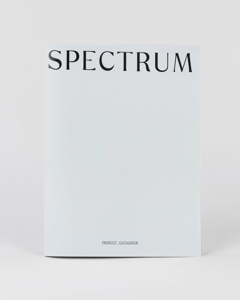
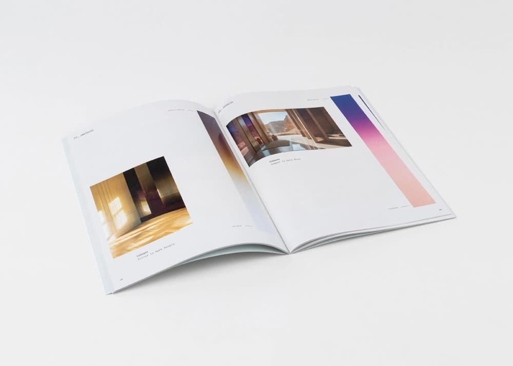
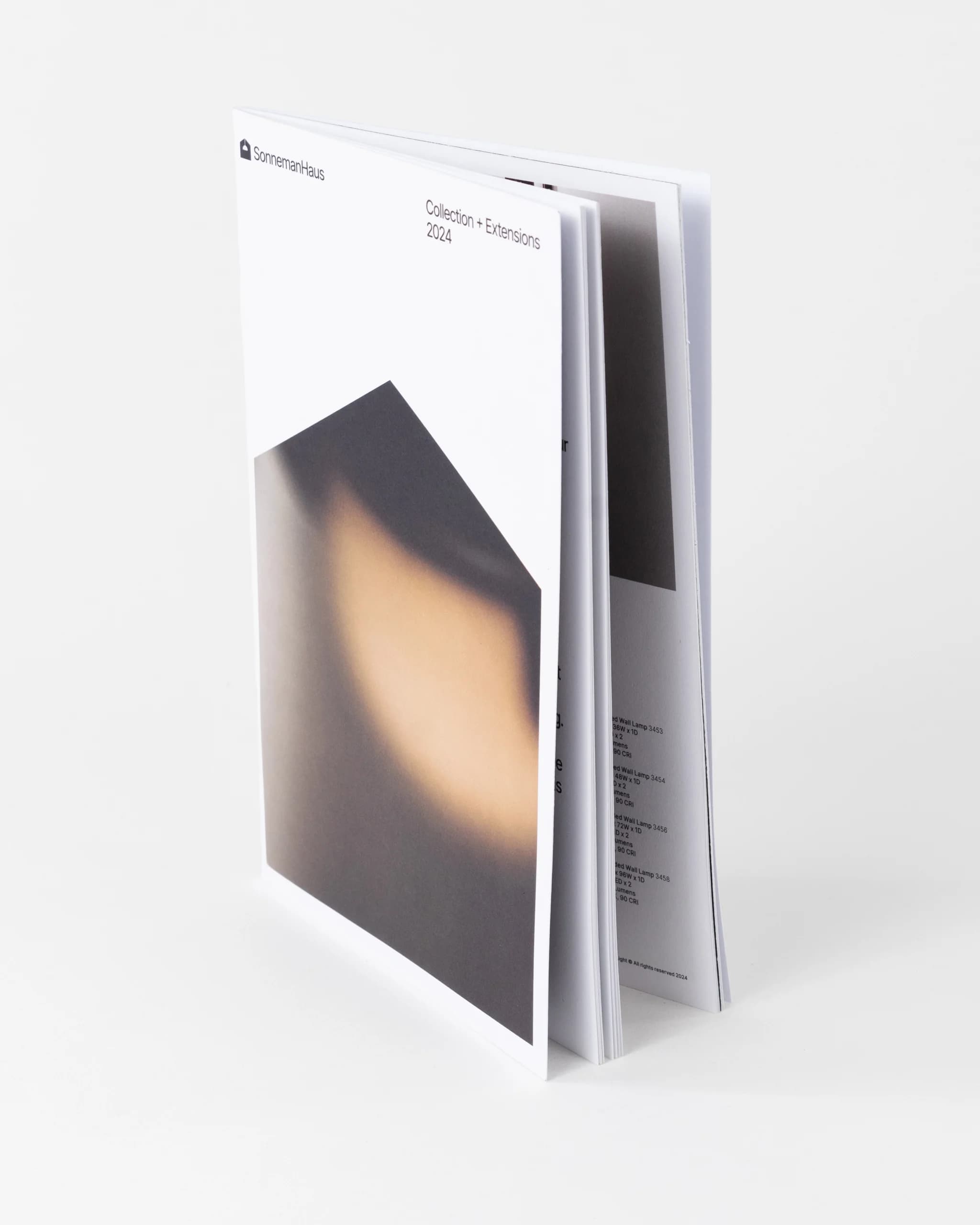
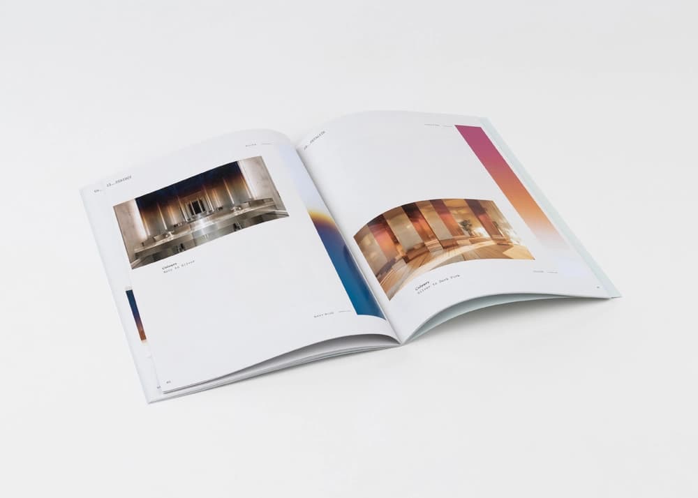
The “SPECTRUM” product catalog is a clean, modern piece designed to present architectural finishes with precision and elegance. Its minimal layout and restrained aesthetic serve to spotlight color, material, and spatial photography, making it a strong choice for brands in design, interiors, and product development.
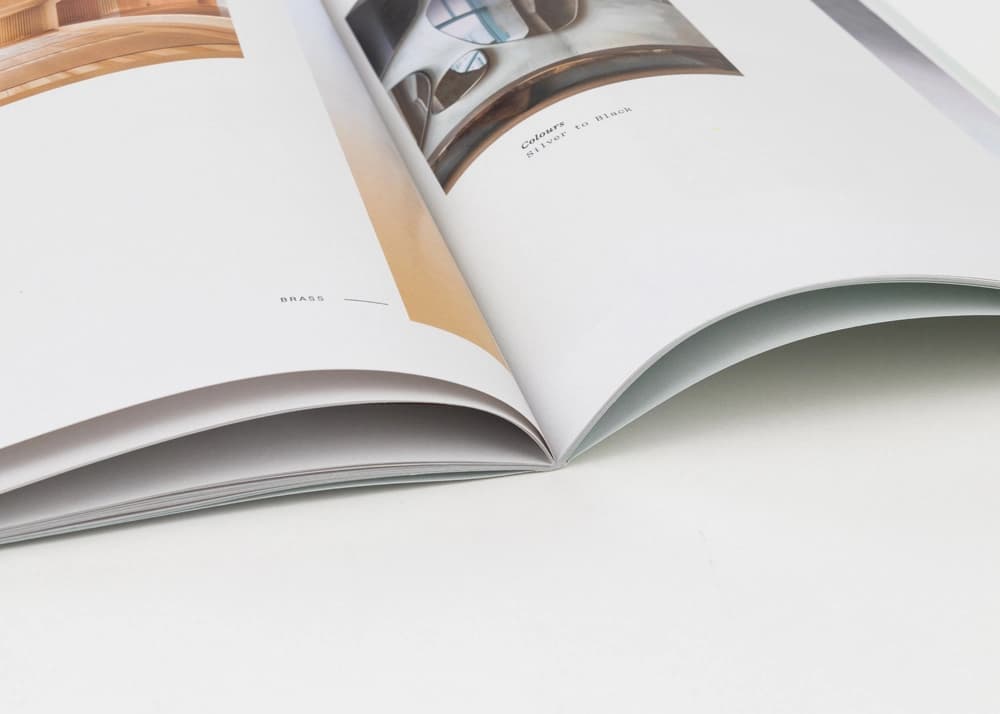
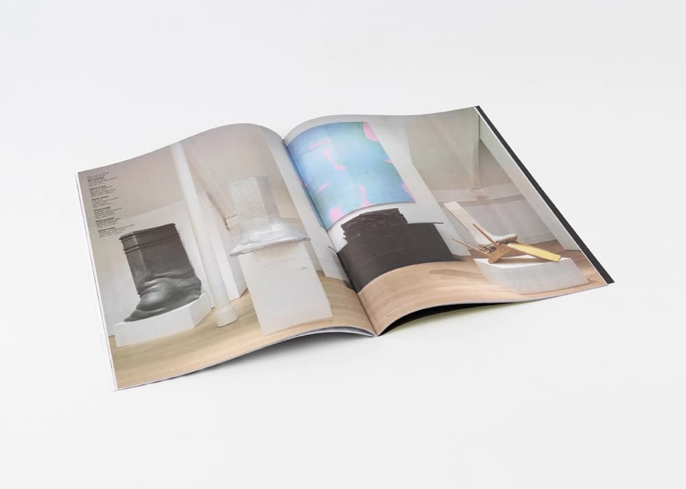
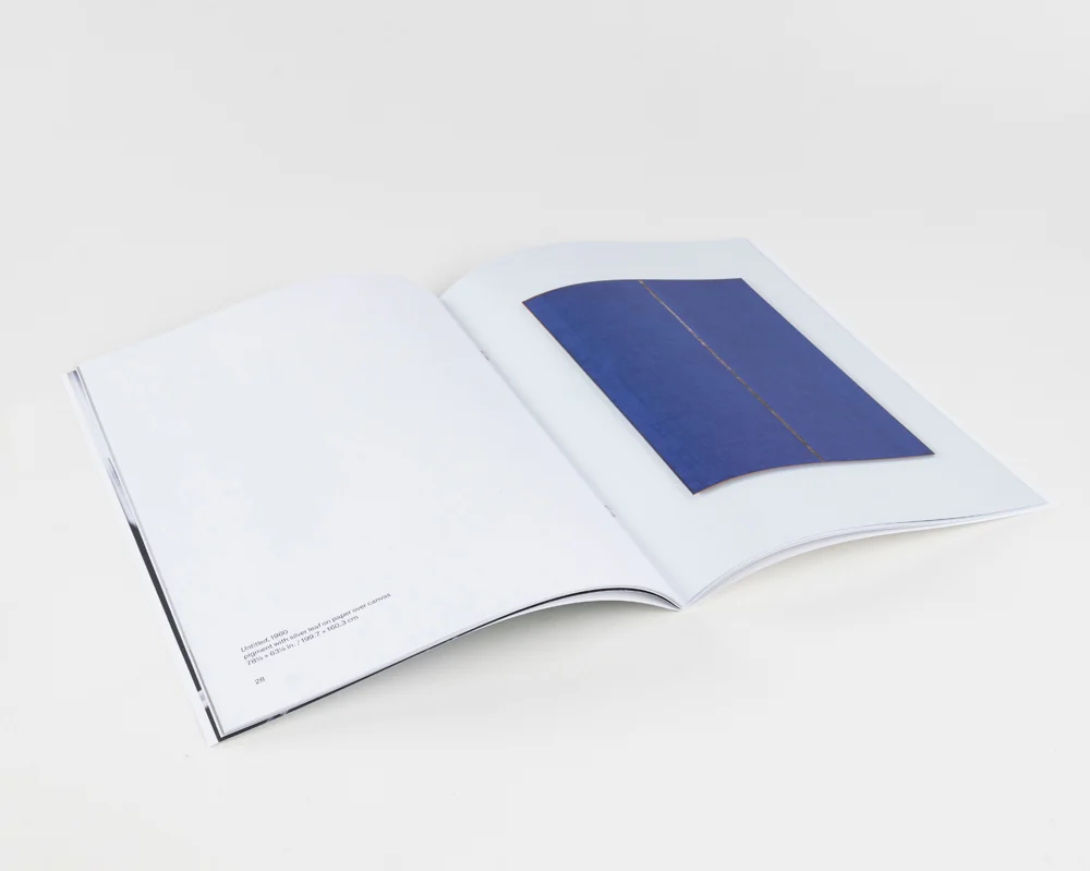
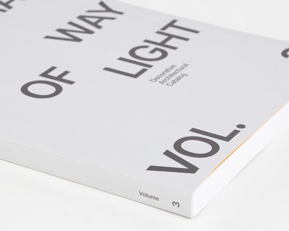
Printed on smooth uncoated paper, this catalog produces soft tonal transitions and high-fidelity image output. The saddle-stitch binding lies flat for easy browsing, while subtle gradients and controlled white space elevate the overall experience. The printing captures neutral palettes with accuracy, preserving the intent of each featured environment.
At Thomas Group Printing, we collaborate with creatives to translate highly visual concepts into printed formats that maintain clarity and tone. Whether it’s product storytelling or layout-driven catalogs, we help guide material and production choices that support both brand expression and usability.
Production notes for architectural finish catalogs
Catalogs for architectural finishes have to reproduce subtle color shifts and quiet material photography accurately. For this Spectrum piece, the restrained layout makes paper feel, ink density, and neutral balance especially important because small color differences can affect how a designer reads the featured surfaces.
For similar interiors, materials, and product-system catalogs, we review color targets, uncoated paper behavior, binding choice, page sequence, proofing needs, and whether copies are headed to showrooms, sales kits, or specification meetings. That planning helps the printed catalog stay useful as a decision tool.