Production notes for minimalist art catalogs
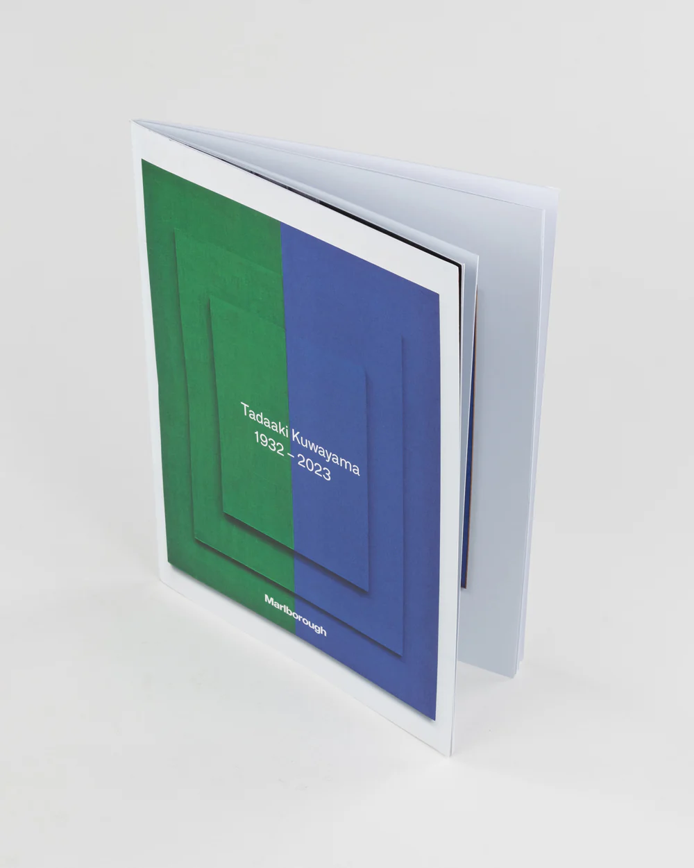
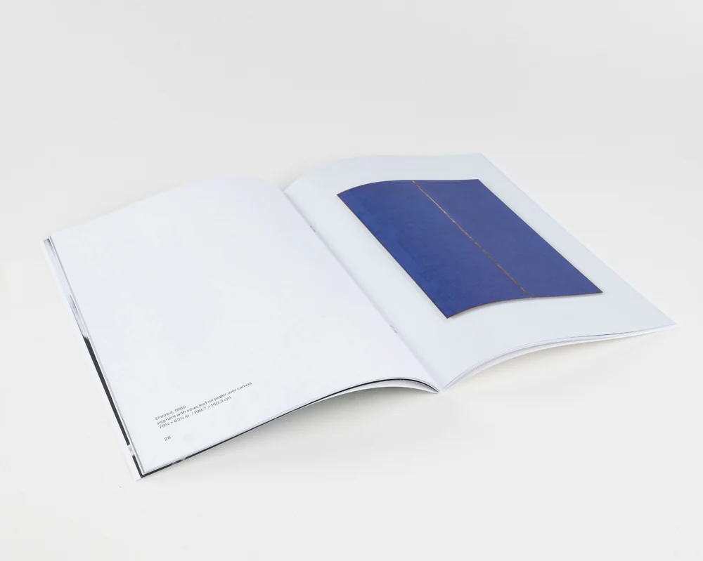
This beautifully printed catalog pays tribute to the work and legacy of Tadaaki Kuwayama, reflecting the precision and refinement of his art. Designed for collectors, galleries, and enthusiasts, this piece showcases high-quality printing that enhances the depth and clarity of each artwork.
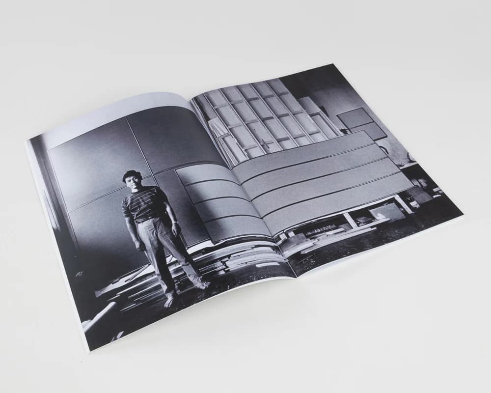
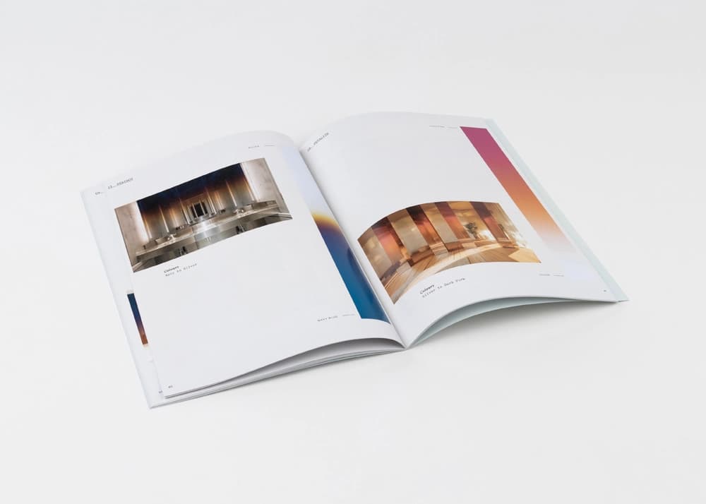
The catalog features crisp image reproduction with excellent color fidelity, preserving the integrity of Kuwayama’s minimalist aesthetic. The binding is expertly crafted for durability and ease of use, while the paper stock offers a premium feel that complements the sophistication of the content. Clean typography and balanced layouts make the viewing experience seamless, allowing the artwork and accompanying text to take center stage.
At Thomas Group Printing, we understand the importance of capturing an artist’s vision in print. Our expertise in high-end printing techniques ensures that every detail, from texture to tonal accuracy, is faithfully represented, making your catalogs and art books an extension of the original work.
Minimalist art catalogs leave little room for production noise. For a Tadaaki Kuwayama catalog, paper tone, color fidelity, margin consistency, and image placement have to be controlled carefully because small shifts can distract from the precision of the work.
For similar gallery and collector catalogs, we review proofing standards, page sequence, paper finish, binding method, color targets, and packing requirements before production. The goal is a printed object that supports close viewing while preserving the restraint of the original art.