Why It’s Important to Choose the Right Paper
While everyday office paper can feel interchangeable, professional print stocks are chosen for a reason. Paper affects color, drying time, ink holdout, show-through, folding behavior, mailing weight, and the way a finished piece feels when someone picks it up. The same design can look crisp and premium on the right sheet or dull, flimsy, and hard to read on the wrong one.
That is why paper selection should happen before a job is sent to print. Quantity, page count, finish, binding, mailing requirements, and audience all influence the right choice. A short-run handout, a sales brochure, a premium catalog, and a bound book may all need different stock even when they use the same brand colors.
Paper Types for Printing
Each paper type has features that can help or hurt depending on the project and run. Common choices include:
- Matte coated paper. Matte stock has a smooth coated surface with lower glare than gloss. It is a strong choice when you want polished color reproduction while keeping text easy to read under office, retail, or event lighting.
- Glossy coated paper. Gloss stock uses a high-shine coating that can make photographs, rich color, and product imagery feel more vivid. It can also show fingerprints and glare more readily, so it works best when visual impact matters more than long-form reading comfort.
- Uncoated paper. Uncoated sheets have a more tactile, natural surface. They are often used for stationery, forms, books, invitations, and brand pieces that need a softer or more editorial feel. Color can appear warmer or less saturated because the paper absorbs more ink.
- Bright white paper. Bright white stocks have a clean, high-contrast surface that can improve text definition and make colors feel sharper. They are useful for business materials, technical documents, and pieces where readability is critical.
- Text and cover weights. Text weights are commonly used for interior pages, while cover weights are heavier and more rigid. Combining the two is common for booklets, catalogs, reports, and presentation pieces that need durable covers without making every page too bulky.
- Photo paper. Photo stock is designed for image reproduction and is usually heavier than ordinary glossy paper. It is best when the printed photograph is the point of the piece rather than one element inside a larger business document.
Professional printers work with these paper families every day and understand how they behave on press, through finishing, and in the mail. If you are choosing between several stocks, a printer can help compare samples against the actual design, not just the paper name.
Characteristics of Paper
In addition to the paper family, several characteristics affect the final outcome:
- Coating. Gloss, silk, satin, and matte coatings influence ink holdout, glare, drying, and perceived color richness. Uncoated sheets absorb more ink and usually create a softer appearance.
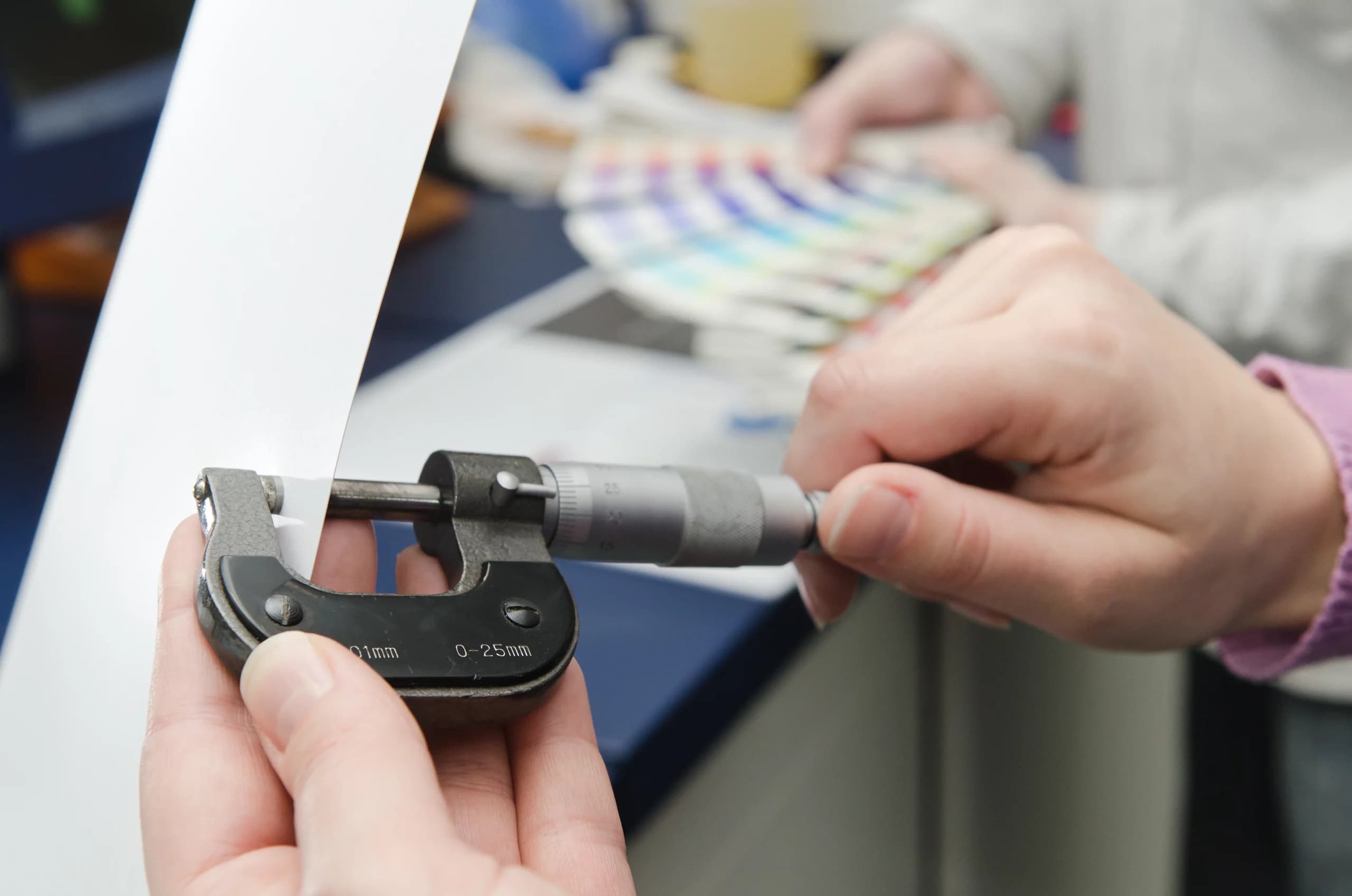
- Weight. Heavier paper feels more substantial but can increase postage, spine bulk, folding resistance, and shipping cost. Lighter paper can reduce cost but may feel too thin for premium materials.
- Brightness. Brightness is measured on a scale where higher numbers reflect more light. Brighter papers can make text and color feel crisper, while warmer sheets can feel more natural or editorial.
- Opacity. Opacity controls how much print shows through from the other side of the sheet. It matters for double-sided pages, books, catalogs, and anything with large fields of color.
- Grain direction. Paper grain affects folding, scoring, and binding. Grain running the wrong way can create cracking, stiffness, or pages that do not turn cleanly.
How paper choice affects common print jobs
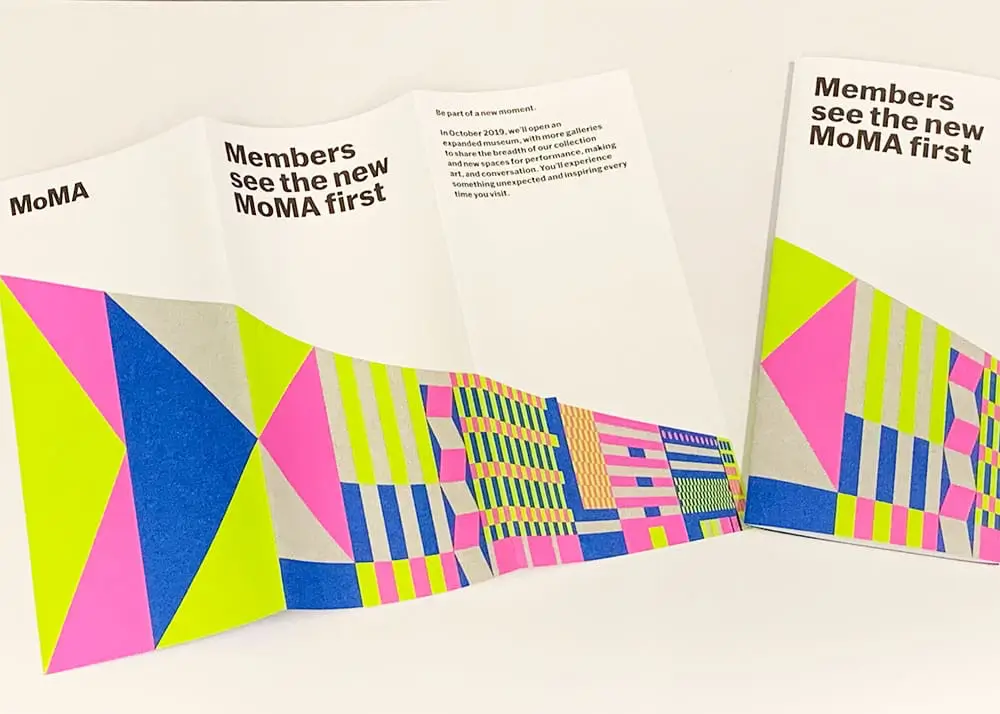
For brochures and sell sheets, the best stock usually balances color impact with fold quality. Gloss can make photos pop, while matte or silk coatings often read better when the piece includes dense copy, charts, or comparison tables.
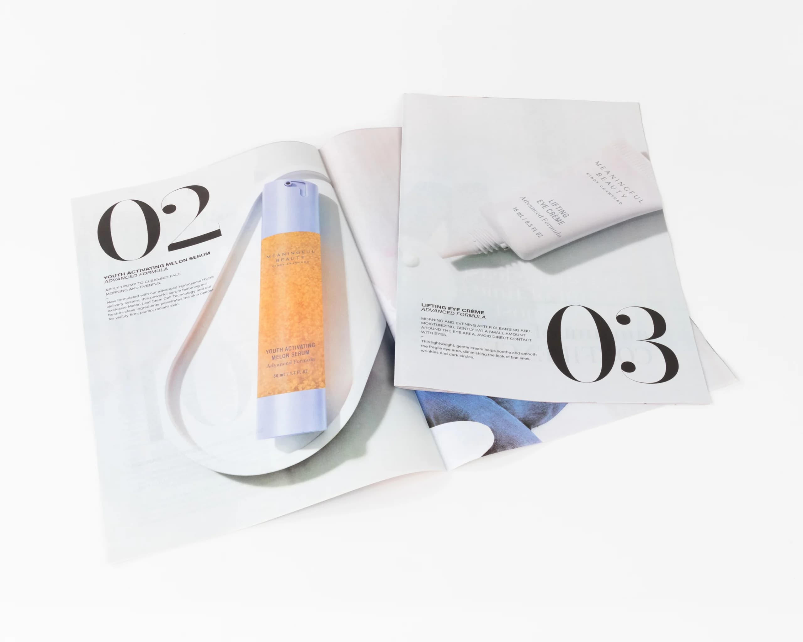
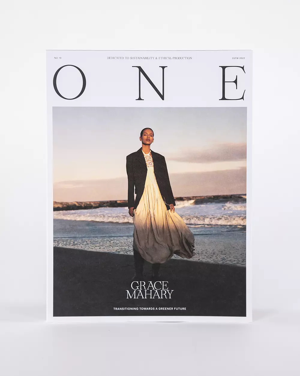
For catalogs, magazines, and books, page count and opacity become more important. A beautiful sheet that feels good as a sample may create a book that is too thick, too heavy to mail affordably, or too transparent for double-sided pages. The paper has to support the whole finished object.
For stationery, invitations, and premium brand pieces, texture and writing surface matter. Uncoated or specialty sheets can make the piece feel more personal, but they should still be tested for legibility, ink coverage, and finishing details such as scoring, embossing, or foil stamping.
How to narrow the paper choice
Start by separating practical requirements from preference. If the piece will be mailed, postage weight, folded size, tabbing, and durability may rule out a stock before color or texture is considered. If the piece will be bound, the number of pages, spine style, and cover weight can decide whether the finished book opens comfortably or feels too bulky.
Next, compare the paper against the artwork. Heavy photography usually benefits from a coated or smoother sheet because the ink sits cleaner on the surface. Long-form text, forms, worksheets, and pieces that people need to write on often work better on uncoated paper. If the design includes heavy solids, dark backgrounds, or fine reverse type, ask for a proof or sample so show-through, drying, and contrast are checked before the full run.
Finally, treat paper, coating, and finishing as one production decision. A heavier cover stock may need scoring before it folds. A soft-touch laminate may change how dark color appears. A textured uncoated sheet may make foil or spot gloss feel less precise than it looked in a mockup. Choosing these pieces together helps avoid late file changes, schedule surprises, and finished pieces that do not match the design intent.
Questions to answer before choosing paper
- Will the piece be read closely, viewed quickly, mailed, handed out, or kept?
- Does the design rely more on photography, fine type, heavy color coverage, or tactile feel?
- Will the job fold, bind, score, perforate, emboss, or receive another finish after printing?
- Does the finished weight affect postage, fulfillment, shipping, or event handling?
- Do brand colors need to match a prior print run or a specific approved sample?
Reach Out To Us Today
When it comes to deciding what paper type and characteristics are best for your project, trusting a professional printing company with your next print run can help make the difference between a good outcome and a striking, visually engaging outcome. Contact us today with your size, quantity, page count, finish, timeline, and any samples you like. Thomas Group Printing can help you choose a stock that fits the design, budget, and finished use.