Why color setup matters before you print
If a project uses color, one of the first production decisions is whether to print it as four color process, spot color, or a combination of both. The right answer depends on what the piece needs to reproduce: photography, brand colors, simple graphics, metallic effects, or a mix of those elements.
Four color process printing, also called CMYK printing, uses cyan, magenta, yellow, and black ink in tiny overlapping dots. That makes it the standard choice for full-color images, gradients, and multi-color artwork. Spot printing uses individually mixed inks, often specified through the Pantone Matching System, to reproduce a specific color more directly.
When four color process printing is the right fit
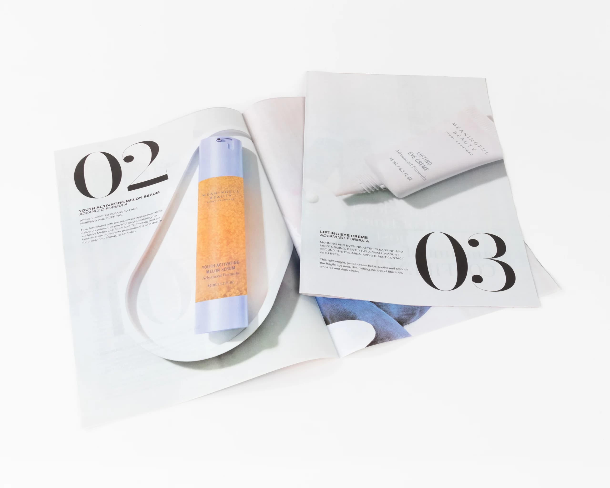
CMYK process printing is usually the best option for projects with photography, illustrations, full-color backgrounds, or many different colors on the same piece. It is commonly used for brochures, catalogs, magazines, lookbooks, postcards, and other marketing pieces where the artwork needs a full range of color.
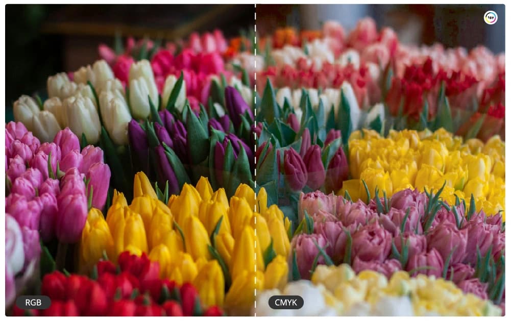
Process color is also practical when the design contains several images or when matching every individual color as a separate ink would be inefficient. A well-prepared CMYK file can produce rich, consistent results, but some very bright, fluorescent, metallic, or tightly specified brand colors may shift because they sit outside the CMYK color range.
CMYK is not a sign that the job is lower quality. It is simply the normal language of full-color print production. The quality depends on the press, calibration, paper, image resolution, proofing, and whether the file was built for print instead of converted at the last minute from web artwork.
When spot printing is the better choice
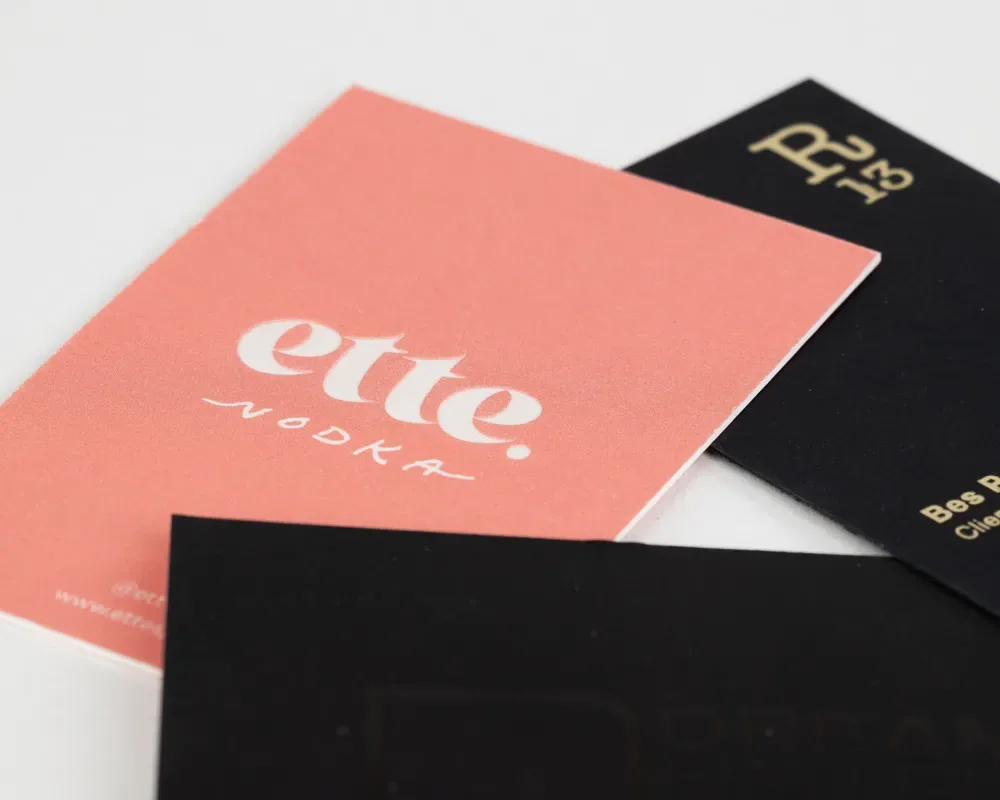
Spot color is useful when a specific color must stay consistent across a brand system. Logos, stationery, business cards, invitations, packaging, and premium event materials often benefit from spot colors because the ink is mixed to the target color instead of simulated through CMYK dots.
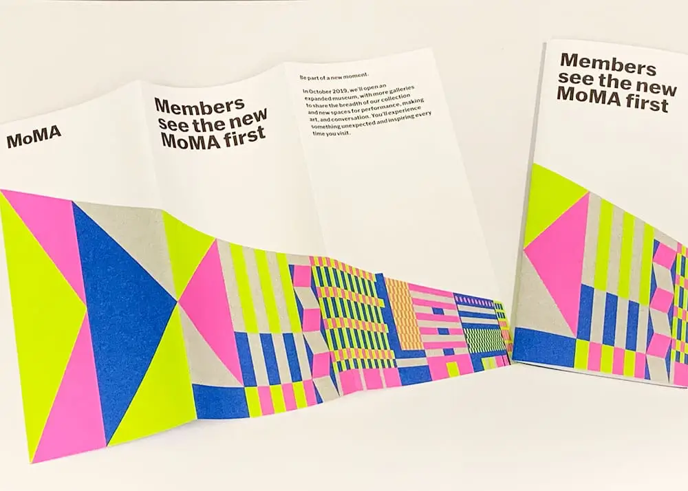
Spot printing can also handle special effects that process color cannot reproduce on its own. Metallic inks, opaque white ink, fluorescent colors, and some foil stamping or specialty-finishing plans may be specified alongside or instead of process color depending on the press, substrate, and finish.
Spot color is most valuable when the color is simple, prominent, and critical. A one-color logo on uncoated stationery is a very different production problem than a catalog spread with photography, shadows, and dozens of colors. The more image-heavy the art becomes, the more likely CMYK or a CMYK-plus-spot setup will be the practical choice.
Four color process vs. spot printing
| Project need | Four color process | Spot printing |
| Best for | Photos, gradients, full-color artwork, many-color layouts | Logos, exact brand colors, simple premium graphics |
| Color method | CMYK dots combine to simulate a wide range of colors | Each ink is mixed or specified as its own color |
| Typical products | Brochures, catalogs, magazines, postcards, lookbooks | Business cards, stationery, invitations, packaging |
| Budget profile | Efficient for complex full-color art because the same four inks carry the whole image | Efficient for limited color systems, but every added spot ink can add setup and proofing steps |
| Proofing need | Use a calibrated digital or contract proof for color-sensitive photography | Confirm Pantone references, paper stock, finish, and whether the ink is coated or uncoated |
| Watch out for | Some Pantone colors cannot be matched exactly | Extra inks can add setup cost and may not fit photo-heavy art |
How paper and finish affect the decision
The same color can look different on coated, uncoated, textured, recycled, or colored paper. Coated stock usually holds sharper dots and richer ink density, while uncoated stock can soften contrast and absorb more ink. That does not make one paper better than the other; it means color expectations should be set around the actual substrate.
Finishes also matter. A matte laminate, gloss coating, varnish, foil layer, emboss, or die-cut can change how color reads in the finished piece. If the color sits under a coating or beside a specialty finish, plan the color system and proofing path before the production file is locked.
Can you use both?
Yes. Some jobs use CMYK for photographs and add one or more spot colors for a logo, brand accent, metallic effect, or specialty finish. This can produce a stronger piece, but it also changes file setup, proofing, press planning, and cost. If you are considering a fifth color or a specialty ink, flag it before production rather than after the artwork is built.
The safest workflow is to share the final use case, quantity, paper, color-critical elements, and any Pantone references at the start. That lets the production team recommend whether the job should stay CMYK, move to spot color, or combine both methods.
A practical decision path before quoting
Start with the artwork. If the piece is mostly photography, gradients, or multi-color marketing design, CMYK is usually the baseline. If the piece depends on one exact logo color, packaging color, or event-system color staying consistent across repeat runs, identify the Pantone or brand target before quoting.
Then consider the production method. Digital presses may simulate spot colors, while offset printing can add true spot inks when the run, color target, and budget justify the setup. Paper and finish can shift the result in either direction, so the proofing plan should match the final stock and coating as closely as practical.
Finally, decide what needs approval. A routine brochure may only need a digital proof, but an annual report, packaging piece, invitation suite, or color-critical launch piece may justify a hard proof or press check before the full run is released.
File setup checklist
- Convert photography and full-color artwork to the requested CMYK profile before final export.
- Name spot colors consistently in the design file so duplicate Pantone swatches do not output as separate inks.
- Mark any color-critical logo, background, or product image before proofing.
- Keep rich black, overprint, transparency, and knockouts intentional, especially when type sits over color.
- Send a packaged source file or print-ready PDF with linked images, fonts, bleeds, and crop marks handled correctly.
Common production mistakes to avoid
The most common mistake is assuming that a screen color, RGB value, or web hex code can be reproduced exactly in ink. Screens emit light; paper reflects ink. A good printer can get very close in many cases, but the production path has to start with the right color target.
Another common issue is adding Pantone colors to a file without deciding whether they should print as true spot inks or convert to CMYK. That choice affects plates, proofs, price, and press setup. Make the decision deliberately instead of letting export settings decide it by accident.
Professional color printing in NYC
Thomas Group Printing is a fourth-generation commercial printing company in NYC. If you are preparing a color-critical print project, send us the artwork and project details. We can help confirm the right color process before the job reaches press, which is much easier than correcting the wrong setup later.