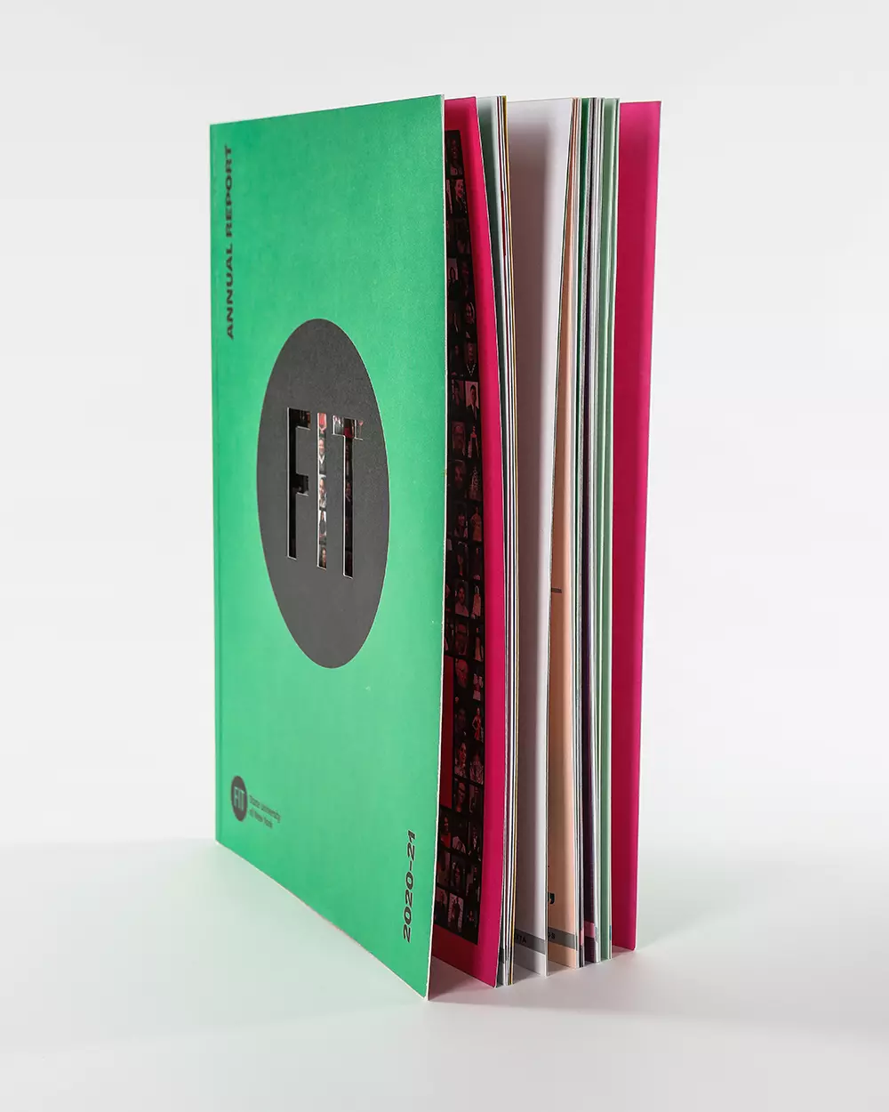
What we love about this annual report example:
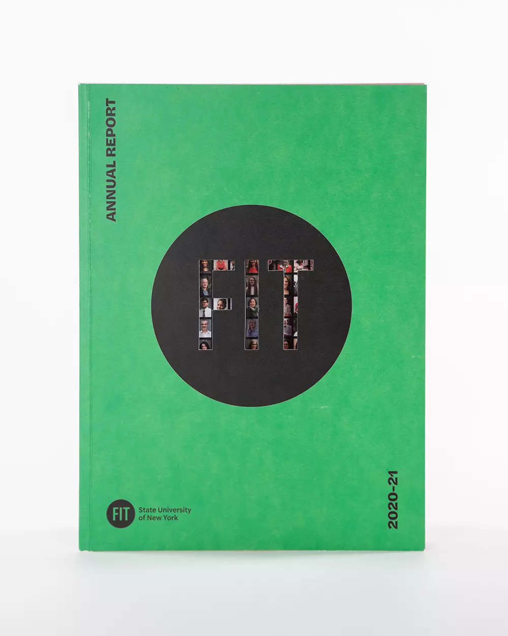
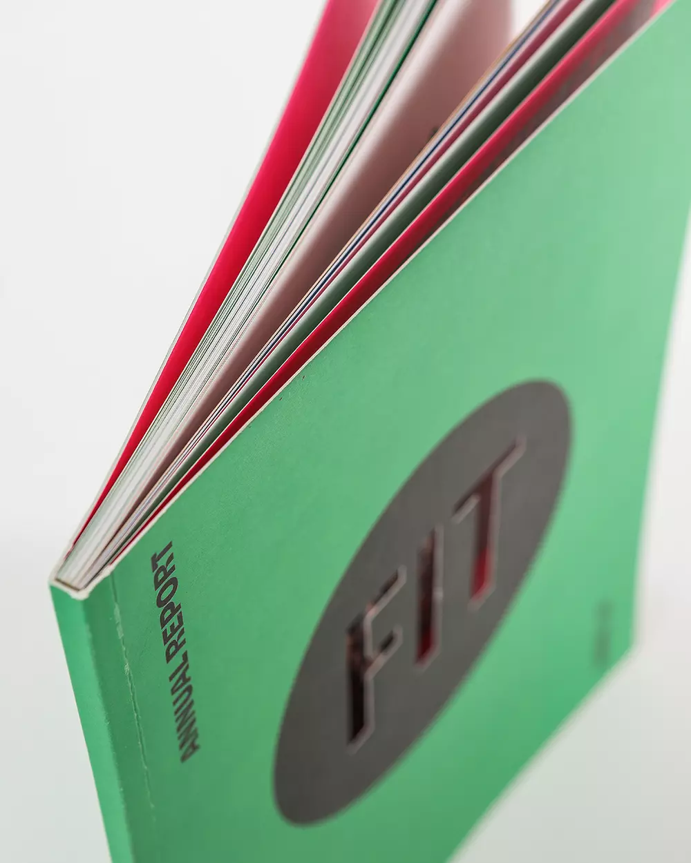
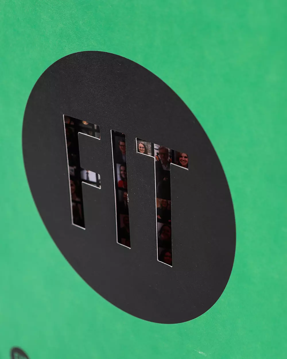
The ‘Annual Report’ for FIT showcases exquisite print craftsmanship. The choice of 180# Mohawk Options Cover & 100# Mohawk Options Text adds a high-quality feel to the piece, while the perfect binding ensures a professional finish. A unique element of this project is the die-cut “FIT” logo on the front cover, adding an extra dimension of brand recognition.
Print & design specs:
- Project Size: 9×12
- Paper Type: 180# Mohawk Options Cover & 100# Mohawk Options Text
- Binding: Perfect Bound
- Finishing Method: Die Cutting
- Client: FIT State University of New York
Production notes for die-cut annual reports
A die-cut cover gives an annual report a memorable first interaction, but it also adds production risk. The FIT report combines heavy Mohawk cover stock, text pages, perfect binding, and a front-cover cutout, so the review has to balance brand impact with binding strength and clean finishing.
For similar university, nonprofit, and institutional reports, we check dieline tolerances, cover thickness, spine width, inside-page alignment, proofing needs, and whether the die cut exposes important artwork or text underneath. That planning helps the finished report feel designed rather than fragile or gimmicky.